Dear friends, let's full review new design of the social network Vkontakte 2016. So, here we will analyze all the features. We will also try to answer popular questions. It is known that work on the new design of VKontakte was carried out for more than a year and a half and was presented to us on April 1, 2016.
So, now we will analyze in more detail what new VK offered us. First, we notice that we have received a design that is unified for all existing Internet devices. For many, it is very important that it opened on screens with a resolution of 1366 by 768 pixels.
What exactly has changed?
Improvements have affected almost the entire Vkontakte site! So, it became more convenient for us that the background the table is much darker, and only elements with information remained white (for example: wall, page, audio section, etc.). And the blue bar at the top of the site now takes up the full width of the screen. So now it has a logo, notifications (bell), music and a user profile button installed on it.
Finally increased the fonts
Now, the page itself has become almost full screen. The good thing is that the dialog box is now split in half. So, now you can see your chats on the left, and the dialog you selected is open on the right, in detail. Now it's easy to react to a new message or quickly switch between multiple conversations.
At the same time, your unread messages have become more visible, they are marked with a blue dot that will disappear after reading. And your messages are now marked with neither a surname and a name, but simply "You". Interestingly, a green dot on a friend's avatar indicates that he is online. 
Significantly improved notifications
Now, they are under the bell in the blue bar of the site. Here you will find friend requests, likes, information about upcoming events, and so on.
It's great that in communities now you can immediately subscribe to updates so as not to miss important news. You will be reminded of them by the notification bell located next to the red dot.
There have been improvements in the section "Audio recordings"
So, we now have the opportunity to create our own playlists, right in the process of listening to music, using the "Play next" function. We will notice it when hovering over the audio recording. And on the right is a column: my audio recordings, friends updates and other tabs. 
The news feed has changed globally
As a result, the pictures became larger in size and more visible. In addition, a right column has appeared in which you can select what you are currently interested in (photos, videos, communities ...)
Of course, we notice that social network VKontakte is very interested in its users: where do we go, what do we comment or “like”. As a result, based on the information collected about us, we can receive a list of communities that we would be interested in. And then, it displays them first.
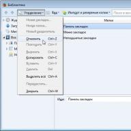
It should be noted that left menu has become very versatile. Now instead of sections, we now see clear icons. And for our convenience, the most frequently used functions are duplicated in the blue bar of the site.
As for viewing our account, now it has become much more comfortable! So - on the left is the fixed user information, and on the right, the wall itself scrolls. At any time, the user can view the wall even to the very end, while friends, groups, news will always be at hand ...
P.S. I hope this information is useful to you!
P.S.S. More visual updates Vkontakte 2016 can be seen in this video! I look forward to your feedback!
The new design became available to beta testers for the first time on April 1st, later switch to new version with the possibility of rollback could any user of the social network. It's funny to say, but I did it literally at the beginning of August, and then the final release was already prepared. So, what made us happy VKontakte?
Appearance
I do not have very good eyesight, and even with glasses on my 21.5-inch screen, the fonts of the VKontakte website looked small. Of course, it was possible to manually zoom the site or change only the size of the letters, but then in some places the layout fell off, which did not look very nice. I was also very annoyed by the huge margins on the sides. Almost 2/3 of the screen was just empty!
In the new version, the site has become visually wider, the font size has increased, as well as image previews, which is very cool. Of course, they don’t argue about tastes, but, in my opinion, from the point of view of design, VK has definitely become better, in any case, it’s much more pleasant for me personally to use it now.

All avatars and group icons have become round, this can annoy someone, but I don’t see anything wrong with such a display.

When opening photos, comments are now displayed on the right, and not below, by the way, I find this display option more informative.


Messages
Two display options are now available for conversations. In the first, classic, you see only the dialogue itself, and in the second - a list of the last contacts with whom you communicated. The second option resembles the implementation of messengers for tablets and, in my opinion, is very practical. To enable the second option, you need to click on the settings gear at the bottom of the screen.


Group administrators will appreciate the ability to quickly access their groups from the left panel and immediately see unread messages from publics.

Music
The music control panel is now always in the top bar, not just when you're listening to it. This is convenient and allows you to quickly turn on the current track without having to go to the audio recording page.


Audio recording icons have also become round.
Notifications
Someone swears that VKontakte copied notifications and the entire top status bar from Facebook, but I don’t see anything wrong with that, in the end, the main thing is that it has become more convenient. Clicking on the bell will display recent activities with your account: replies, likes, reposts, etc.

News
Many were afraid that VKontakte would copy the content display system from Facebook, and this happened, however, unlike FB, VK developers give users the choice of whether to use the new sorting or not, I think this is right. By the way, VKontakte has long needed such filtering, because the news feed has long been filled with reposts of friends from all sorts of groups like "millionaires' diaries" and "the lonely lioness has stopped being lazy."

Optimization
The developers noted that they completely abandoned Flash and switched to HTML5 for audio and video content. It's a sound decision, and as a Safari user, I fully support it.
Criticism from Pavel Durov
Pavel Durov on his page criticized the new design of VKontakte and gave as many as seven reasons why they could have done better. I do not agree with all of them, for example, the display of photos, I think, has become better and the right panel with comments is quite appropriate. I also find it more convenient to pin the left and top panels when scrolling. But the width of the news feed could really be made larger, because now VK still has a decent amount free space On the sides.
Below is a quote from Paul's original post:
infographics
Below is some infographics from the official VKontakte blog:

Conclusion
When I first saw the new design of VKontakte, it reminded me of an enlarged copy of the mobile application for the iPhone, however, this is not surprising, it was just amused that the redesign of the application took place before the redesign of the site. But despite the similarity, the site and the VK client do not visually copy each other completely.
In my opinion, appearance The site has become more pleasant and modern. Some things were made more comfortable, some more beautiful. However, Pavel Durov's criticism is also fair, primarily for the width of the news feed. What prevented making it even wider, given that there is enough space?
What do you say, dear readers? Do you like the new design of VKontakte? If not, why not?
P.S. I take this opportunity to invite you to subscribe to
“Chief editor of the GetGoodRank blog, web analyst, blogger.
Social network VKontakte updated user interface. Now faster, easier, easier. But this is only according to the developers. Users complain about the difficulty of finding familiar options. This clearly proves that habits are strong, and a drastic interface change is not always a good thing.”
On August 17, 2016, all users of the social network VKontakte were transferred to a new design. According to representatives of the social network, it took more than 1.5 years to create an updated design. Starting April 1, 2016, users could optionally switch to the updated design for testing purposes. This made it possible to understand what users like / dislike, fix more than 2500 minor errors. Thanks to the implemented update, interaction with the system and loading speed have improved, and there is more room for innovation.
What's new in the updated VK?
Speed and stability
The developers have fixed bugs that affect the stability of the platform. All sections have been rewritten and optimized. Removing the outdated, browser-unsupported Flash technology in favor of HTML5 ensures stable operation of audio and video players on mobile devices.
The updated version of VK has improved accessibility for visually impaired users.
New VK Design: User Interface
The working area has become wider, the distance between blocks and elements has increased, the font size has increased, thereby providing much more space for navigation. Added right block for fast switching between subsections.

Updated Messages service
IN updated version VK has two options for displaying dialogs. In the classic version, the names of the interlocutors are placed in the right block:

The new interface offers the user a list of recent conversations and an active chat window. According to the developers, in this mode it is easier to switch between dialogs and messages.

To change the dialog interface, you need to enter the settings through the gear icon at the bottom of the screen.

Navigation in the top bar of the page
All notifications are now reflected in the top bar of the page, and not as usual next to each of the menu items. Notifications for new messages, likes, comments, as well as managing audio recordings will now be reflected here. After starting a musical composition, the note icon is replaced by audio recording control buttons.
According to the developer, each element has been rewritten in the updated version to speed up loading and system response to user actions. Navigation is easier, features are more accessible, and new features are easier to implement. So, tips for stickers, graffiti images in dialogs, and a supplemented photo editor are already available to users.
The developers give the following results of the effectiveness of innovations:

The first user feedback on the new VK design
- inability to stay on the old, familiar version
- difficulties in finding the usual options (for example, the page settings that used to be in the left panel are now moved to the top panel and open by clicking on the profile avatar. The drop-down menu is available only by clicking, not by hovering the mouse).
- similar to FB design
- narrow field for displaying content
- failure to add content (photos, audio recordings)
- missing comments
During the transition, users noticed malfunctions of the site, in particular, news, audio recordings, and dialogues periodically became unavailable.
The social network "VKontakte" announced the release of completely updated mobile and iOS. Literally everything has changed in them - both new functions for users and a redesigned user interface have appeared. Update earlier this month.
New for leading mobile platforms, they have lost the side navigation menu that opens by clicking on the hamburger menu. From now on, the so-called tabbar is used - a single panel at the bottom of the screen, which combines the key functionality of the social network. Thus, now users can literally switch between news, messages, notifications and search with just one touch.


In addition, VKontakte's biggest update for Android and iOS also introduces brand new recommendations and search sections. They include records, videos, live broadcasts, stories, communities and personal pages that may be of interest to the user. Basically it will be novice musicians, photographers and writers. The recommendations are based on the new Prometheus algorithm - with the help of it, the social network plans to promote high-quality content.

The notifications section with a new design now includes all notifications and friend requests - just like in the web version of VKontakte. Likes have also changed to red, and the view counter is shown on each post without the need to open a separate post.
The update will be available for installation in Google Play And App Store within the next days. Or you can download it on the Thrashbox.
Popular social network In contact with» has changed the design. Andrey Rogozov, the operating director of the company, reports that the new look of the social network is the result of the fruitful work of specialists, which has been carried out over the past year and a half.
In contact with
The design team pursued the main goal - to make the site look recognizable on all devices. It seems that they have achieved this, and now users of the web version can easily find the desired section in mobile application, and vice versa.
Removal of redundant elements, more space for new features, and increased screen width and fonts, making the interface more readable. The menu on the left has undergone significant changes - the names of the items have been shortened and icons have been added, and the most popular sections " News" And " Messages» are now at the top.

IN " news» each element is displayed in a new way. News lists, search and comments are located in a separate block on the right. If you do not want to view all news, click on the section " Interesting first”, located directly below this block.

Concerning " Posts”, then its designers created it completely from scratch. Now the conversations and the current chat are on the same screen, which greatly simplifies the process of switching between conversations. A blue dot marks unread messages, and a green dot indicates that the user is currently online.

Chapter " Answers"disappeared completely, and find out who put the mark" I like» your photo, video or other publication, you can in « Notifications". All applications for adding to friends, mentions and name names are also displayed here. If you are afraid to miss something new on the page of the person you are interested in or in the community, you can subscribe to notifications. As soon as a new post is made, an indicator will appear next to the bell icon at the top of the screen.

Good news for those who like to publish and view photos - now the pictures are displayed in a larger format and in a magazine layout (that is, without spaces between them).