Many people know that Apple is currently the most valuable brand in the world. But no one knows about the “bitten apple.” Why is it bitten? Who is Ron Wayne? We will learn about this further...
Start:
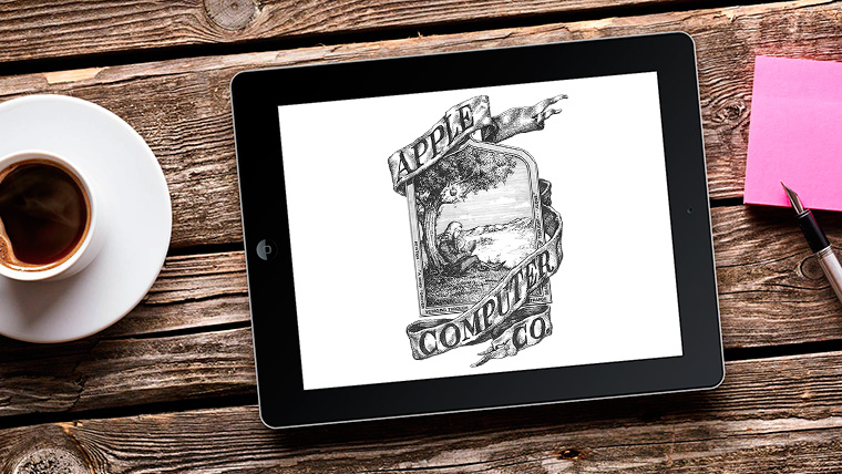
Ron Wayne, Co-Founder of Apple Computers Co.
The first logo was created by Ron Wayne.
At the time, Ron was the third co-founder of Apple, owning 10% of Apple shares. But after 11 days of registration, he sold them for 800 Dollars.
You can call him, forgive the rudeness, a loser. If Apple is now the most valuable brand, then Ron would be a Billionaire at the moment.
Apple Computers Co.'s first logo.
The first logo is not like all subsequent ones. It's something like a work of art. There was Newton on it, and above him was that ominous apple that would change the life of the Physicist, Alchemist, in general - scientist - Isaac Newton.
If you look at the frames of the logo, you will notice a certain inscription: " Newton... A Mind Forever Voyaging Through Strange Seas of Thought... Alone..."(Newton... The mind that sails alone through strange seas of thought).
Rainbow Apple?
Agree, the first logo was very interesting. But at that time it was of little use for business.
Steve Jobs, Former CEO of Apple
Then Steve Jobs set the task to create a simple, light, memorable logo that would not be associated with fruits or vegetables, but would be associated with Apple.

Rob Yanov, Graphic Designer
And then he turned to Rob Yanov, a graphic designer. He explained how the logo was created on the Revert To Saved blog
Rob bought some apples, put them in a bowl, and thought about how to create a logo. He wanted to eat an apple and bit into it. And then, like Newton, it was as if he had been hit on the head. The similarity of the pronunciation of Byte and Bite (Byte and Bite) also came to his aid.
And Yanov created a new “logo” in a week.
![]()
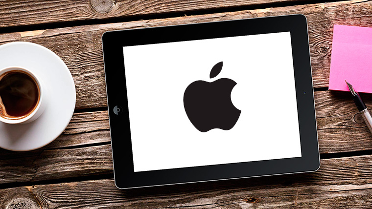
Second logo of Apple Computers Co.
But why is it colorful? There are many myths, such as that the logo was created in honor of Gays, because Apple supports them. But the “logo” was invented a year before the rainbow colors were accepted into the ranks of Gays.
What then? Why did Rob use Rainbow? Let's figure it out.
It turns out that these six colors were depicted on the "apple" due to the fact that Apple monitors were color and showed these colors.
Black is the color of courage...
The rainbow logo lasted for 22 years. A very long time. 1998 At that time, Steve, who had been ousted from Apple, returned. At the time, Apple was in a difficult position. Competitors, innovations...
Jonathan Ive, Senior Vice President and Designer at Apple
Jonathan Ive, currently known as the Designer, Vice President of Apple and the “Creator” of iOS 7, has created the new iMac G3 case.

iMac G3 in several colors
New colorful computers literally pulled Apple out of a cloud of problems. But it’s somehow strange to use colored apples on a colored Mac. Realizing this, Apple abandoned the old logo and adopted the color black.
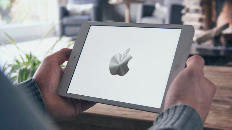
The third logo of Apple Computers Co.
Since 1998 - The black, dark “logo” of the apple will be with Apple.
Metal and Aluminum - new perfection
2007 Apple begins to launch the first iPhones. And at the same time, he refuses Computers in the name, saying that Apple will create different products for life. And it turns out Apple ComputersWe need to create a new logo. So that it is suitable for both the new iPhone and the future iPad. Jonathan Ive, again, came up with a new logo, gray, it looks like a mixture of metal and aluminum with a sheen.
Apple's fourth logo
This “logo” is still used by Apple to this day. In the meantime, we need to wait until Apple thinks of changing its “logo”.
The world has turned into a huge platform for consumption. Now the prospect of any company achieving world fame is practically zero, especially considering the fact that brand promotion is by no means the cheapest pleasure. Before the world was overflowing with brands that managed to firmly fill all the niches in the economy, the famous iPhone logo also appeared, which represents a bitten apple.
If we remember the beginning of his career path, one can only admire his perseverance on the path to his goal - to conquer the whole world with his creation. The iPhone logo left the world of specialists and became widely known among ordinary users of modern technology. Its creation can be called a modern legend.
A bitten apple - iPhone logo
It is no coincidence that this symbol of Apple has become one of the most famous in the world. There are actually many reasons why this happened. The first reason, of course, is the promotion of the company, the second is the recognition of the logo. The indirect reason why the iPhone logo could achieve such fame is one old, but inferior to any criticism, theory that the logo should not only be well remembered visually, it must be easily recreated graphically, that is, depicted on anything using any means without any effort or time. The following car logos can be summed up under this theory: Volkswagen, Opel, Mersedes and the like. Therefore, the bitten apple became a successful example reflecting the effect of this method.

The logo itself appeared a little earlier than the company. This happened due to the fact that the creators initially wanted to play on the world-famous legend about Newton’s apple, which supposedly led the scientist to the brilliant discovery of the law of universal gravitation. The idea, of course, was original, but the proposed logo turned out to be too bulky and difficult to understand.
1976 - appearance
The iPhone logo was designed specifically for the company by advertising agency representative Regis McKenna. As the legend goes (this is where numerous speculations arise), Rob Yanov, the art director of this agency, bought apples in a supermarket and began to do something like an experiment: he cut the apples and arranged them in orderly rows, in general, he carried out various “apple operations” . As a result, quite unexpectedly, he settled on a bitten apple. Who bit him and why?

There are two theories about this. According to the first, the bite makes the apple “real” and does not give it the outline of other fruits. The second seems more logical - it is based on the fact that the English words “byte” and “bite” sound similar, which creates a kind of pun (“byte” - “bite”).
A certain preacher saw in the bitten apple the seduction of Adam through Eve. This funny man even wrote an entire treatise in which the devilish origins of the “unclean” Apple are sorted out.
Rumor has it that Jobs, tired of waiting for Rob to develop a logo, simply bit into an apple and said that if he didn’t come up with anything worthwhile in the near future, they would take an apple with a bite as a logo. However, this version is more like a baseless rumor; Rob himself has never mentioned such a story.
It is noteworthy that the first apple was rainbow. This is how another theory arose, according to which the bitten apple carried a deep meaning. Allegedly, this was an allusion to the suicide of a scientist who made a powerful breakthrough in the field of computer technology and information science. According to the stories about him, he was gay, and ate the apple, having previously filled it with poison, in order to leave the mortal world in which he was subjected to incessant humiliation.

In fact, it was Turing who contributed to the rapid solution of the Enigma encryption machine, which the Germans used during World War II. But at the end of the war, when everyone around learned about Alan’s unconventional sexual orientation, the technician was faced with a dilemma - forced chemical castration or practically lifelong imprisonment. Wanting to fully engage in science, the brave scientist decided on the first option, but he could not withstand the effect of the operation performed on him - his appearance changed completely, he did not recognize himself in the mirror. In general, this transformation influenced Alan's decision to take his own life. However, his mother insisted that the incident was an accident, saying that in no way did her son have suicidal tendencies; his experiments with various poisons were to blame.
To smithereens
In fact, the “gay apple” theory does not stand up to criticism. The thing is that the rainbow became officially recognized as a logo of sexual minorities much later. They only officially started using the rainbow in 1979, three years after the apple logo was introduced.
Jobs was very insistent on the rainbow apple logo, according to Rob, because in his understanding it was a symbol of mutual understanding and tolerance. It is known that Jobs was a hippie in his youth, which is why he chose a logo to match his thinking.
There is another version: the “color kaleidoscope” of the apple was used to show the fact that Apple technology is capable of working with color. This was new in the years described.
The most plausible version seems to be that the company abandoned the rainbow coloring in 1998, due to the fact that this symbol firmly became part of the ranks of sexual minorities. And the company did not want to get involved in the propaganda of any views; they only wanted to produce gadgets useful to any society.
Sly Steve
Thanks to the use of a color logo, which was rare in those years, the public noticed the desire to get ahead and gave the newly formed company a chance to exist. By the way, it was thanks to the diligence of Steve Jobs, who gained confidence in the Regis McKenna agency, that the brand developed. Poor Rob, who agreed to everything, never received a single cent for the logo and its promotion.
It's all in the details
It was the attention to design detail that attracted new clients. For example, taking into account recent events in the field of technical breakthroughs in modern mobile devices, it can be noted that the iPhone 5S logo is made in the form of a glowing apple thanks to the airbrush technique.

Undoubtedly, it is not so much the technical characteristics as the aesthetics of fashionable devices that attract modern youth, who are greedy for everything bright and shiny. The iPhone 6 logo is also distinguished by its wisdom - it is made of liquid metal. This approach, however, also speaks to the practicality of these devices, because this way the logo will be more difficult to scratch and make unsightly.
The design has advanced so much that they now even produce numerous iPhone cases with the logo. Although, if you take a quick glance at the counters with phone accessories, you can immediately identify the sales leader. It was Apple that managed to so strongly instill in people’s minds the apparent superiority of this brand over others that competition in the market is practically zero - yes, cheap Chinese phones are becoming popular, but no one has yet surpassed the iPhone. For better or worse, progress is being made, and who knows what logo the city tabloids will cover tomorrow.
The very first Apple logo looks more like a painting than a brand name. It showed Isaac Newton reading under a tree with a falling apple hanging over it.
Along the outline of the frame is a line from William Wordsworth’s poem “The Prelude”: Newton... A Mind Forever Voyaging Through Strange Seas of Thought... Alone (“Newton... A mind that sails alone through strange seas of thought”).
The emblem turned out to be rich in references and secret meanings, but too overloaded and complex to be used for marketing purposes. It lasted only a year.
By the way, the author of the logo, Ronald Wayne, was the third co-founder of the company. He did not believe in Apple's success and recklessly sold a 10% stake in the future corporation for only $800. And thereby deprived himself of a multi-billion dollar fortune.

The official logo that adorned the company's first product, the Apple II, was a bitten apple made of bright multi-colored stripes. In just a week, it was created by designer Rob Yanov at the request of .
The artist bought apples and painted them, removing unnecessary details. So only the outline with the handle remained. At the same time, the famous bite on the right side was created without hidden meanings. It was needed only to accurately distinguish the fruit from a tomato and other fruits.
The rainbow color palette prompted speculation about hidden sympathies in support of the LGBT community, as well as references to the famous mathematician and cryptographer Alan Turing, who was gay.
In fact, the rainbow in the logo does not carry any secret messages. As conceived by Steve Jobs, on the contrary, they were more than explicit: six colors indicated that the computer supported color image output. And in times of monochrome monitors, this is a significant advantage.

The brand new iMac in Bondi Blue stood out against the dull beige and gray boxes of regular PCs. The old rainbow badge would have looked childish on the shiny plastic, so the designers changed it to a color-matching logo in a translucent style.

Returning after more than 10 years of absence to a company that was going through difficult years, Jobs set a course for change. And the first thing he did was change the brand name, abandoning bright colors in favor of a monochromatic outline of an apple.

A little later, the Apple logo began to be depicted in the style of the Aqua graphical interface, which appeared in macOS X. Such logos have long been used on business cards and signs at the company’s headquarters in Cupertino. The red version was used for extended warranty support for Apple Care, and the darkened graphite version was used on Power Mac G4 system units.

Then the logo changed slightly. The glossy shine remained in place, but the apple turned from glass to highly polished metal. The logo has been used for many products, but is most memorable for the boot screen of iOS devices and the About This Mac screen in OS X.

After almost 15 years, Apple is returning to the minimalistic logo that was first introduced back in 1998. The recognizable monochrome silhouette of a bitten apple against a contrasting background - this is how it is now known all over the world.
Few people know, but the photo above is the real Apple logo.
Apple's main symbol has been updated several times already. Changing the logo is a kind of control point, marking a transition to new views and principles of the company. Moreover, these changes were never random.
Are you sure you remember the old company logos? Let's figure it out.
Newton logo (1976 - 1977)
The first Apple logo is far from the modern, laconic symbol. By and large, he stood out in those days. The logo was created by one of the founders of Apple, Ronald Wayne, who quickly sold his stake in the company. It's a cool idea - to use the widely circulated story about the discovery of gravity by Isaac Newton. But its implementation leaves much to be desired.
Minimalism? No, we haven't heard. The logo looks more like a coat of arms: a shield, a heraldic ribbon, a pompous signature. It is absolutely not suitable for application to products, and all because of its bulky geometry and the abundance of small parts. Fortunately, it didn't last long.
Rainbow Logo (1977 - 1998)

An ambitious company needs a recognizable symbol. That's why Apple's founders turned to designer Rob Janoff of Regis McKenna. It was he who created the well-known bitten apple in rainbow colors.
In an interview, the designer said that he simply bought a bag of apples and experimented with them for a week. Many hoax fans like to attribute hidden meanings to this logo. But Rob Janoff debunked all the myths, according to him, he did not make any references to Alan Turing or the Garden of Eden:
- stripes of all the colors of the rainbow indicate the competitive advantage of Apple computers, which could display color images;
- the incorrect order of these colors is justified by the fact that an apple leaf should be green;
- the fruit was “bitten” so as not to confuse the apple with other fruits;
- the consonant “byte” and “bite” remain only curious coincidences.
Monochrome logo (1998–present)
By the end of the nineties, Apple was on the verge of failure. After his return to the company, Steve Jobs made a splash - he closed unpromising projects, updated the staff and stopped renewing licenses for proprietary software. In order to forever disown the disastrous old course, the logo was also changed. From 1998 until now it has been a solid apple.
If the size of the previous logo rarely exceeded 1.5 x 1.5 cm, then the monochrome version is usually larger, brighter and more noticeable. Nowadays the “apple” is painted in three colors: black, white and gray. But before there were more varieties, here are the most famous:
iMac G3 logo

The release of the iMac G3 in 1998 marked the return of Apple. Stylish all-in-one PCs had just such a logo, and it was the same color as part of the case. The PowerMac, Apple Studio Display and iBook, released a year later, received similar logos.
“Aqua” logo

This logo first appeared on the PowerMac G4 Cube and was used for several years in advertising and banners. Plus, it could be seen in early versions of OS X, because the logo fit perfectly into the concept of the Aqua interface.
"Glass" logo

Users of Apple's desktop OS first saw this logo in 2002 when upgrading to OS X Panther. With the release of the iPhone in 2007, this symbol moved to mobile devices. It was replaced only in 2013 in connection with the release of iOS 7 and the abandonment of skeuomorphism.
Metal logo
Metal logos are one of Apple's favorite and recognizable features. Having appeared in the iMac G4 all-in-one PCs, such logos roamed across all categories of Apple products. iPhone cases with holes? All for the sake of the treasured metal apple.
Logo “Product.RED”
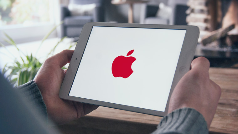
Apple is partnering with Product Red to help the latter raise funds for the Global Fund to Fight AIDS, Tuberculosis and Malaria. On the official website of the Cupertino company you can find products, part of the proceeds from which go to this fund. Once a year, on the first of December, on World AIDS Day, Apple turns its logo red.
What's next?
Of course, Apple won't change the shape of its logo. You shouldn’t expect exotic color solutions from the company either; minimalism is in fashion now. Perhaps soon we will see the familiar logo made from new materials. Maybe
Your phone can say a lot about you. For example, about your personality. Therefore, we want to tell you about our range and features of glowing iPhone logos for fans of a wide variety of styles - with a variety of tastes. You can make your phone even more personal. All you have to do is make a choice and enjoy a vibrant life.
We make all types of luminous logos for iPhone
From simple to the most complex.
Technologies
Today we actively use several types of materials and designs to make luminous iPhone logos.
You can see each one in the illustrations below.
![]()
![]()
Polycarbonate
Ultra-durable and optically clear type of plastic. That is why it is successfully used in various areas of production, including in the manufacture of car headlights and iPhone 5C housings and those famous glowing Macbook apples. This is an ideal material for the production of light logos. This type of material is best suited for simple and multi-color logos, such as a glowing apple or company logo. ![]()
![]()
Outline illuminated logos
We first proposed the idea of contour lighting in 2012 and immediately won its niche. This is a great way to “emphasize” a logo of any shape. The width of the luminous contour is 0.3 mm, and its color can be different. ![]()
![]()
Combined
Such logos combine several materials, for example, metal + enamel, carbon + enamel, etc. depending on the task. The elements that need to be highlighted are made of jewelry enamel. This type of luminous logos is many times more complex than those made from plastic, but the result is impressive - all the coolest ideas with luminous logos are implemented on the basis of such logos. ![]()
![]()
Metal and Swarovski
In this case, Swarovski stones act as an element of glow. Each stone has an active backlight from the inside, the light breaking by the cut of the stone creates a fantastic effect.1 /9
![]()
What logo shape is right for you?
The glowing logo is one of the most interesting design elements that you can add to your phone during the modding process. Its shape can be very diverse, depending on the client’s preferences. A company's logo, a manufacturer's trademark, a sports team's emblem, the stylized initials of the owner, or that stylishly bitten glowing apple - there are no boundaries or frames. Coultury specialists will not only bring any customer’s wishes to life, but will also give a number of different tips regarding this and other elements of customization.
![]()
Power consumption of glowing logo
Any light source requires power, and a glowing logo for a custom iPhone is no exception. When designing the backlight chip, our company’s specialists focused on minimizing its power consumption. To illuminate a small logo, one diode is used, which consumes up to 0.9% of the battery charge per hour of activity. Large logos require two diodes, but even in this case, the user of a stock or modded device will not notice absolutely no difference in its autonomy.
![]()
Choose the color of the glow
There are no restrictions in choosing the glow color for a glowing logo. Based on the user's preferences, his character can be determined. Red, for example, symbolizes the unbridled desire for success, pink unites passion and purity, orange is synonymous with extraordinaryness, green mesmerizes with the balance of warmth and coolness, blue conveys affection and loyalty, and blue conveys calm and tranquility. Despite the variety available, most users choose a cool white glow.
How to decide on a glowing logo
Some logos can only be made from specific materials and using a specific technology. However, most orders can be completed using several different methods. In any case, Coultury specialists will present to the client all possible ways to implement a specific luminous logo with a calculation of its cost, and will also provide consultation on the advantages and disadvantages of each of them. The user will only need to provide the desired logo, clarify key nuances, and make the final choice.
How to find out the cost
Anything can become your symbol - from initials and abbreviations to the symbol of the most unforgettable event in your life. Even the smallest details will make a big difference.
Any custom logo requires cost calculation.
Moscow, st. Davydkovskaya, 12, bldg. 7
metro station Slavyansky Boulevard (660 meters, 5 min.)
Opening hours:
Tue–Sat: 11:00 to 20:00
Sun-Mon: closed