I know for sure that many people are fond of photography and retouching. Read the article below, which contains many useful retouching techniques, which will allow you to make candy from any photo. The article will be published in two parts, today - its first part
1) Natural light amplification
Sunlight creates texture. These are both areas of shadow and those places where he can shine without interference. To somehow control the light intensity in the picture, you can use this method:
Create a new layer, Ctrl + Shift + N and set it to Color Dodge 15%. Now using a brush and an eyedropper (just pressing Alt) try adjusting the colors a little.

This way you can increase not only the light, but also the saturation of the color gamut, getting a more realistic result.

2) Infrared simulation
File - Browse In Bridge - and open our PC image - Open in Camera raw.
Edit the image of your choice by moving the sliders .. Then go to the HSL / Grayscale tab, and select “Convert to Grayscale”, and set the blue -85, green +90, yellow +20.
Now the sky is almost black, but the bushes are white. You can add a graininess effect - in the Effects tab set 15 for quantity, 20 for size and 80 for roundness. Also add vignette - -30 count, 40 midpoint and -35 roundness.

3) Levels
When applying the Levels adjustment, you can set black and white points to adjust the hues, but how do you determine where the darkest and lightest areas are?
To do this, go to New Adjustment Layer\u003e Threshold. Move the slider to the right until only a couple of white spots remain. These are the lightest spots. So, using the Color Sampler tool, place a marker there.
We do the same by moving the slider to the left - this way we get the darkest part.
Now let's find the neutral gray. Add a new empty layer between the Threshold adjustment layer and the photo layer and fill it with 50% gray. To do this, go to Edit\u003e Fill (Shift + F5), and select 50% Gray - select the Blending Mode Difference.

Select our Threshold again, and move the slider to the left to the end. Then - to the right, until small black dots begin to appear - these are intermediate tones. We put the third marker there.
Remove Threshold and 50% Gray. Create a new adjustment layer, “Levels”. First, top, pipette
click on the 1st marker (dark), and then, respectively.
Done! We have reduced the number of shades.

4) Working with color
Go to the Layer menu, then New Adjustment Layer\u003e Hue / Saturation, set the blending mode to Soft Light, and check the Colorize checkbox.
Let's play with shades - for example, for cold shades we put
hue 210,
saturation 50
lightness 10
but for warm
hue 30
saturation 30
lightness 5

Alternatively, you can create an additional tint layer. Create a new layer, fill it with color, Blending Mode will be Vivid Light, and Opacity 12%. Now invert the mask of this layer, Ctrl + i (anyway, make it transparent). Now you can paint on it with a white brush, giving the desired places the desired shade.
Very useful when working with portraits and textures in the background.

5) Adjust the midtones contrasts.
To increase the amount of detail in landscape photography, you need to increase the contrast of the midtones.
Copy the background to a new layer, Filter\u003e Convert for Smart Filters. Then go to Filter\u003e Other\u003e High Pass with a 3px radius. Change the blending style to Overlay, and open the layer properties menu.

For the first gradient, This Layer, using Alt (breaking the arrows), set the values \u200b\u200b- from 50/100 to 150/200
Thus, we only increased the contrast in the middle tones. To change the High Pass value, simply double click on it in the Layers panel.

6) Sunset
Sunset, especially at sea, is a very beautiful sight. You can imitate it. To do this, go to New Fill / Adjustment Layer-Gradient Map, and open the gradient panel. We expose this gradient, at the same time setting the Soft Light mode to 50%.

You see the result !:

7) creating a smile
Trace the area around the mouth with the Polygon Lasso tool. Then Select\u003e Modify\u003e Feather by 10px. Copy to a new layer with Ctrl + J, and go to Edit\u003e Puppet Warp. You will get such a grid ..

The size of the grid can be controlled through the Expansion field in the top panel. Place points at the anchor points - those places that should not move. Imagine hanging a picture on the wall. Now put dots in those places that you will shift - and move them.
You can hide the grid by pressing Ctrl + H.
8) Illumination of drops
Falling drops are quite a picturesque sight, and it will not be superfluous to correct them a little in color. Alternatively, use a gradient. Create a New Gradient Layer Style (# 772222 (RGB 119, 34, 34) to # 3333bb (RGB 51, 51, 187)):


9) Skin color
If the skin does not look perfect after retouching, it may be due to its overall shade.
You can control it. To do this, create a new layer Adjustment Layer\u003e Hue / Saturation. Select the mask and make it transparent by inverting the color Ctrl + I.

Now paint over the mask with a white brush in the places where the skin is. Depending on the color scheme of the photo, adjust the sliders - everything is very individual here. Our skin color should change, and nothing more.

10) Matching skin tones
A tan or blush can ruin the photo, especially if there are people with different skin tones nearby. But Photoshop has a tool to fix that: Match Color.
Let's imagine that there is a photo where 2 people are captured, and one of them has a clear red skin.
First select the red skin (for example, the Quick Selection Tool - W). Apply a 10-15px feather to the selection and copy it to a new layer.
Then select the non-red skin. And we do the same.

Activate the red skin layer and go to Image\u003e Adjustments\u003e Match Color. Use the sliders to adjust the tone to the desired result. The intensity of the effect can be adjusted through the Opacity of the layer)

11) lower the noise
Images with a lot of noise are annoying. One way to remove noise is through channels.
Copy the layer and go to the Channels panel - we want the channel with the least amount of noise. Copy it and go to Stylize\u003e Find Edges. Then apply a 3px Gaussian Blur.

Now click on the channel thumbnail holding Ctrl and turn on RGB mode back. Go back to the Layers panel and create a mask.
LK on the layer thumbnail, Filter\u003e Blur\u003e Surface Blur - then adjust the sliders to the most convenient option for us. The mask guarantees safety.
The essence of the method is that the darkest parts of the photo - the contours - remain unaffected by the mask, and we blur everything else.

12) Retro effect
Go to Layer\u003e New Adjustment Layer\u003e Curves. Switch to Red mode, and drag the slider a little down for shadows and a little up for highlights. The same goes for Green. But for Blue we do the opposite. The shadows will appear blue, and the highlights will turn yellowish.

Create a new layer and fill it with # 000066. Blending mode - "Exclusion." Now copy the photo's layer and set the Blending Mode to “Soft Light.”
Again, you can group the layers with the photo and play with transparency until you get the desired result.

13) defining layers
If you are working on a complex collage or template, you probably have an overabundance of layers with names like layer 47 / layer 3 copy 2, etc. To avoid confusion, Photoshop has several solutions.
For example, if you select the Move Tool and click on the PC layer, then a list of layers located behind the current layer will appear (although, admittedly, not a very convenient way - if there are a lot of layers and groups, it is difficult to find the one you need)

Or Move Tool + Ctrl + LK on the layer - the transition to the layer you clicked on will be immediately executed.
If you press CTrl + LK on the layer's thumbnail, the entire contents of the layer will be selected.
If you click on the arrow in the upper right corner of the Layers panel, and select Panel Options, then there you can adjust the size of the thumbnails, as well as the style of displaying thumbnails - either displaying the layer relative to the entire content, or simply displaying the layer.

14) Saving resources
If you use plugins, you've probably noticed how they slow down Photoshop loading times.
To avoid this, create a folder named, for example, Plugins_deactivated in the Adobe\u003e Adobe Photoshop CS5 directory (or whatever you have) - and move the extensions that you rarely use there. When you start Photoshop again, it will load faster, and plugins can be returned to their folder as soon as you need them.

15) Sepia
Sepia is a classic of the genre) To enhance the sepia effect, go to Layer\u003e New Adjustment Layer\u003e Photo Filter, and select the Sepia filter with a density of 100%.

Now go to the layer properties and move the sliders for the first gradient. Use Alt to split them apart. This will give us a smooth transition between the corrected and unadjusted areas. Sepia now looks elegant.

16) Remove the binding
Probably, many are annoyed that sometimes objects do not stand where we want, but are attached to other objects. This, of course, is good and convenient, but sometimes it is not necessary. To release the anchor, simply hold down Ctrl while dragging the object.

17) Many shadows from one object
Sometimes you need to create from one object, for example, 3 shadows. It is quite possible to do this. First, cast one shadow. We click the PC on the fn icon - and in the list that appears, select “Convert to Smart Object” - our object and shadow are now one whole. Now we can cast a shadow from both it and convert it back to Smart Object.
Plus, as I already wrote in the post "10 useful Photoshop tricks", you can convert the shadow to a new layer, again by clicking the PC on fn - and choosing Create Layer. So you can create an infinite number of shadows, and applying to each individual effects.

That's all! This was the first part of the post! Thanks for reading! I hope that this material was useful to you) In order not to miss the second part, as well as to receive all other blog materials on time, you can subscribe to or
»
The possibilities of Photoshop are endless: with the help of this program you can create luxurious renderings, the desired atmosphere, emphasize the mood of the picture or completely transform it. It is not always necessary to spend hours or even days processing one photo - often a few minutes and knowledge of several techniques in Photoshop is enough.
You will learn how:
Getting rid of the "ladders" in the gradient
Often the use of a gradient leaves behind "ladders" - color transitions visible to the naked eye. Many designers have no idea how to get rid of them, although there is a simple and quick way. First, change the image mode from 8 bit to 16 bit in the tab Image / Image... Convert the layer to a smart object, if it is not, you can do this in the tab Filters / Filters... Find the item here Blur / Blur and turn on Surface Blur... Move the sliders to get the result that suits you.
If there are several sharp transitions left after blurring, create a new layer using the Ctrl + Shift + N key combination, in the window that opens, select the mode Overlap / Overlay and tick the function Fill with Overlay-neutral color... Open the tab Filters / Filters, Choose a section Noise / Noise and turn on the tool Add Noise... In the window that opens, set the value that will help to hide the remaining transitions.
How to soften the gradient
How to create a sunburst effect
To add the rays of the sun to the image, first you need to select the lightest areas of the picture - it is from there that the sun will shine. This is the easiest tool to do. Color Range.
When the tool window opens, select the mode in the first drop-down list Backlight / Highlights... Then move the parameter slider Dispersion / Fuzziness left and focus on the parameter Range / Range... You need to make sure that the lightest areas of the image are selected.
As soon as you click the "OK" button, the program will select the necessary areas by itself - copy them to a new layer using the command Ctrl + J and convert the layer into a smart object. Go to the tab Filters / Filters, select Blur / Blur and then - Radial Blur... In step Blur Method put Linear / Zoom and set the parameter Quantity / Amount to the maximum. In a small window on the right, the program will show you how the blur will be positioned - it is very important to correctly mark the center, which should coincide with the light source.
To make the rays more saturated, it is enough to duplicate the layer using the command Ctrl + J the required number of times. Select all created layers, right-click on them in the list of layers and select Convert to Smart Object... Now all that remains is to add a little blur: go to Blur Gallery and select the tool Field Blur - with its help you can adjust the degree of blurring in different parts of the layer.
If you want to make the image more realistic, try different layer overlay effects; you can also create a mask and remove some rays from the image using the tool Brush Tool... To make the picture even more attractive, you can create a fill layer, set its opacity to about 3-5%, or experiment with the tool Curves.
How to create a sunburst effect in Photoshop
An unusual way to control brightness with Curves
Everyone who works in Photoshop uses the tool Curves, but few people know what the horizontal Curve, but its use is one of the simplest and most convenient techniques in Photoshop.
To test a new way of using the tool, open any image, create an adjustment layer Hue / Saturation, decrease the parameter Saturation to the minimum and put the layer in blending mode Soft Light / Soft Light... Then create a layer with Curves, apply it to the saturation layer by Alt-clicking on it and make a neat horizontal curve. Select the hand icon on the panel Curves and click on the fragment, the brightness of which does not suit you - now you can easily control the light and dark areas of the image with the mouse without affecting the shades.
The horizontal curve is a convenient way to control brightness without affecting hues
Making the sky richer
Open the desired image in Photoshop and create a new fill layer on top of it. Select a darker shade of the sky as the color. Now make it so that the layer with the color remains only in the sky - turn on the mask and go through the necessary areas with Brushes / Brush Tool... Then go to Blending Options - we are interested in settings Blend, if... Move the cursor to the arrow next to the parameter Underlying Layer and click on it while holding down the Alt key - the arrow will be divided into two parts, moving which, you can achieve the desired effect. If you overdid it and the sky is too saturated, you can always change the layer's opacity.
It's easy to create dramatic effects
How to create the rain effect
Photoshop already has a special function for creating a rain effect, you just need to find it. Go to the tab Window / Window, select item Operations, and then - Image Effects... In the list that opens, find the tool Light Rain, select it and click the arrow at the bottom of the window. The program will create the effect itself, but you can correct it manually.
The rain effect can be created in a couple of minutes
Changing the time of day in a minute
First, create an adjustment layer. Color Lookup, in the tool settings find the file NightFromDay.CUBE - the image will already change colors. Then create a new adjustment layer Gradient Map... Among the gradients you need to find Blue1 / Blue1 or create the one you need yourself. After the gradient layer is created, change its Blending Mode to Soft Light... It remains only to correct the image using the tool Curves.
When reading articles about Photoshop, I am often amazed at how many authors make it difficult to solve essentially simple processing tasks. Many "monumental" writers suffer from this, for example Dan Margulis. But this is forgivable to him - his task is to write about all the subtleties and nuances of the processing process, to consider it from all angles and sides. Although it is precisely this feature of the presentation of material in his books that repels many readers.
In fact, the roots of these "40-step sharpening" techniques stem from a very simple thing - the people who write these tutorials have never worked with a lot of photographs. That is, as a rule, they have a couple of photos and they are ready to kill an evening or two in the process of processing them. But when you have constant orders, and from each photo session you need to seriously process several dozen frames, you start thinking about simpler and more convenient ways of processing.
We will talk about them today. I'm going to tell you about five simple yet very effective Photoshop tools that I use all the time in my work.
Before editing photos in Photoshop, I always work with the frames in the RAW converter first. It is there that I do the main color correction and primary processing of photos. Basically, I create a "skeleton" of processing, and in Photoshop I work with the details of the photo.
So, we have worked with the photo in the RAW converter and open it in Photoshop. Photoshop meets us with a huge number of processing tools for all occasions. But we will talk about the simplest and most effective ones.

The main function of the Dodge Tool / Burn Tool is to lighten / darken individual areas of the image. Basically, you can "paint" the darkening, or vice versa - lighten the picture. It's very simple, give it a try: I am sure you will appreciate this tool. The Dodge / Burn Tool has only two, but very important settings.
Range - Select a field of application
You can use this tool on dark (Shadows), light (Highlights) or neutral (Midtones) areas of the photo. For example, you want to lighten the dark areas of the chin (when processing a portrait) and leave the light ones untouched. In this case, we set the Shadows mode to the Dodge Tool, and it will only lighten the dark areas of the places where we apply it.
Exposure - force of impact
It is very important to correctly set the impact strength. Many people experimenting with Photoshop try Dodge / Burn 100%. And, darkening the image, they get black "holes", and brightening - solid overexposures. Of course, when they get such a result, they no longer return to this tool. But Dodge / Burn is a subtle tool. If you are working on shadows or highlights, try the application strength of 7-10%, if with neutral areas - 10-20%. For each case, the strength of the impact is selected separately, but after working a little with this tool, you will begin to feel what kind of power is needed in each specific case.
Using
Dodge / Burn has a ton of uses:
- Lighten the iris
Just apply the Dodge Tool to the iris - this is the easiest way to lighten it. Thus, you focus the viewer's attention on the model's eyes.
In all these portraits, I brightened the iris of the eyes precisely in order to draw the viewer's attention to the eyes and add psychology to the frame.


- Darken the lines of the face in a male portrait
Cheekbones, jawline, nose line, eyebrows - any facial lines, if darkened a little, will acquire greater volume and contrast. The man in the photo will look more tough and strong-willed.
I use this technique when processing almost all male B / W portraits. For color, this technique is not always suitable, as it “destroys” colors, but it works just fine in B / W picture.
In a woman's portrait, this technique must be used very carefully, since a woman will be decorated only by accentuating those facial lines that give her femininity. Otherwise, you will receive a portrait of a masculine creature.
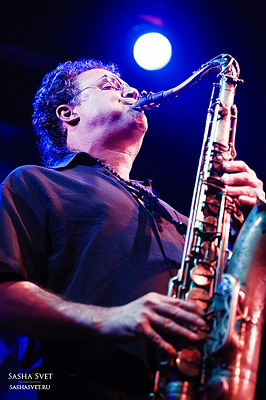
- Brighten backlight areas
Backlight is a wonderful thing in itself. But if you use the Dodge Tool to enhance its effect, the picture will become even better. It looks especially great in concert photographs, when the musicians are illuminated by good backlighting.
- Whiten teeth for your models
It is using the Dodge Tool that it is easiest and most effective to whiten teeth in a photograph. A little later, I will definitely write a separate lesson on correct teeth whitening with the Dogde Tool.
2. Clone Stamp
There are several tools for retouching images in Photoshop, and each of them is good in its own way. But the "Stamp" is the most versatile tool to use.
Its function is to take a certain area of \u200b\u200bthe image and copy it. Thus, we can, for example, retouch wrinkles - simply "replacing" them with areas of smooth skin. To do this, press Alt and select the area from which the picture will be taken, and then, simply by clicking on the necessary areas of the image, we will copy it to them.
It is important to pay attention to two parameters in the stamp settings:
Mode
These are the modes in which the stamp will work. For example, in Darken mode, the stamp will only “replace” areas that are lighter than the selected area. In fact, you can darken the light areas of the image, which is why the name of the mode is Darken. And, accordingly, in the Lighten mode, the stamp will work only on the darker areas of the image, lightening them.
Clone Stamp has many modes of operation - experiment with them, I'm sure you will get interesting results.
In my opinion, it makes no sense to describe the operation of each mode - in Photoshop for all tools, essentially the same principles of operation of the modes operate, only slightly changing for the specifics of a particular tool.
Opacity stands for opacity. Simply put, the lower you put the percentage in this setting, the more transparent the stamp will be. For example, at 100% the stamp will completely replace the selected area, and at 50% it will be semi-transparent. For face retouching, as a rule, 10-30% is used, otherwise the stamp mark will be too clearly visible.
Using the Clone Stamp
- Retouch
Retouching in all its forms is the main purpose of the stamp. First of all, the stamp is used for skin retouching - to remove wrinkles, bruises under the eyes, swelling and other beautiful creations of Mother Nature.

You can also retouch, for example, an unwanted subject in the frame. Unless, of course, it takes up half of the photo.
It is very convenient to use a stamp to eliminate small overexposures. For example, your model has a small speck of overexposure on the tip of the nose. We take a stamp, set the Darken mode and darken this speck in a couple of clicks.
3. History Brush
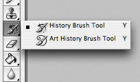
History Brush is a time machine for photo processing. You can take any stage of processing and paint with a brush from it according to your image.
The History Brush is fraught with tremendous possibilities. I have already written in detail about the operation of this tool in a separate article. In it you will find a detailed tutorial on the use of history brushes and learn how to sharpen only the areas of the image you need.
Sharpening is certainly not the only area of \u200b\u200bapplication. In future articles, I will tell you how to work with color in a photo using the History Brush.
4. Black & White
The Black & White tool is located in the Image-\u003e Adjustments tab. Or you can just create an Adjustment layer on the photo.

The main function of the Black & White tool is the "correct" translation of a color image into b / w. Correct because you can change the black and white display of each color. Thus, you can get a beautiful and "tasty" b / w picture.
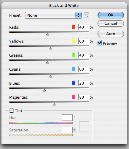
But the functionality of B&W is not limited to this.
With this tool, you can get a very interesting and colorful picture. Apply B&W to our picture and then turn on the Overlay layer mode.
Now, by manipulating the B&W controls and layer transparency, we can get a very interesting picture. For better clarity, I set the Opacity of the B&W layer to quite high - 62% and turned the Greens, Cyans, Blues and Magentas controls to the maximum.
As we can see, the picture immediately became richer and more contrasting (click on the picture to enlarge).

Now let's pay attention to the check mark Tint... By enabling it, we can tint the image in the color we need.

Using
The options for using B&W in both color and B / W are a lot.
In one of the following articles, I, using the example of processing several photos, will tell you about all the basic nuances of working with Black & White.
5. Shadow / Highlights

Shadow / Highlights is also located in the Image-\u003e Adjustments tab (by the way, there are many interesting tools there, I advise you to experiment with all of them)
This tool is designed to darken overexposed areas and draw highlights from shadows. Apart from the most obvious application of eliminating overexposures and under-highlights, S / H also works great for creating a sense of greater depth in a picture. We can add dark tones to the light areas, and light ones to the dark ones. Thus, the picture will become more voluminous and deep.
For example, in this photo using S / H I added volume to the puppy's coat and the picture immediately became more interesting.

In fact, Shadow / Highlights are an absolutely indispensable tool for any serious editing. Almost any photo can be made better with the right S / H.
I would like to talk about all the S / H settings and its functionality, but this is really a topic for a separate article. In the future, I will definitely come back to the Shadow / Highlights theme, but for now, just try experimenting - try different settings and see the result. In my experience, this is the most effective way to learn new things.
As we can see, all these tools are very easy to use, but at the same time they are amazingly effective. Try experimenting with them and you will feel how many possibilities they give when processing.
I think it's worth doing a series of articles on simple yet very effective tools in Photoshop. And in the next article I will talk about the tools for serious work with color in photography.
Any processing of a photo can be compared to the development of a film - without this it will not be possible to get an impressive result. In the simplest case, the camera is editing the frame. We don't even notice it. But in-camera algorithms don't always work perfectly. Firstly, the capabilities of the camera are limited (the processor is not as powerful there as in the computer). Secondly, the automation cannot accurately predict your creative ideas, therefore it will give an average result.
By the way, the author's ideas are not always embodied even in ideal conditions for shooting. For example, when photographing in low light, we often get “noisy” shots. What if the camera can't handle the noise on its own? In this situation, you should resort to post-processing in a photo editor.
In this article, we will explain how to remove noise from an image. This is one of the first operations with which photo retouching begins. We will be working in Photoshop CC. All screenshots were taken in the MacOS operating system, but in Windows the windows and settings dialogs look the same.
There are several ways to remove noise in Adobe Photoshop, we will consider two of the simplest ones.
We recommend that you duplicate the original layer and perform all operations with noise on the copy of the layer. If the correction turns out to be very strong, you can always reduce the opacity of the layer or add a mask to it to remove the effect from certain areas of the image.
To duplicate a layer, use the keyboard shortcut Command + J or select the menu item Layer → Duplicate Layer / "Duplicate layer".
Removing noise in a RAW converter
You should start working with noise at the stage of RAW conversion. This is what will allow you to get the highest quality image without loss of detail. By the way, sometimes it is better to leave a little noise, but keep the details in the image, than to get a "clean" but blurry and undefined picture.
But even if you are processing an already converted image or shot in JPEG format, you can use the Adobe Camera Raw module for conversion, it works great on any images.
To launch Camera Raw, either open the RAW file in Photoshop or use the menu item Filter / "Filter" → Camera Raw Filter / "Camera Raw Filter".
In Adobe Camera Raw, noise reduction controls are located on the Detail / "Detail".

It is customary to divide noise into two components: color (Color) and luminance (Luminance). The color component is visually expressed in the form of multi-colored grains and is quite easy to remove. The luminance component is the grain. And here, when adjusting, the main thing is to find a balance between the moment when the noise interferes with the perception of the image, and the moment when the photo becomes "plastic" due to excessive blurring of details in the process of dealing with noise.
It is often sufficient to remove only color noise. Luminance is left because it looks more like a film grain and does not interfere with the perception of the image so much. Work with noise removal should be carried out at 100% magnification of the image and select the values \u200b\u200bof all parameters based on the structure and size of the photo.
Let's now take a look at the parameters that can be affected when removing noise in Adobe Camera Raw.
Color noise:
Color / "Color" - the force of the tool. The higher the value, the stronger the effect on the color component. 0 - the degree of influence is 0, the parameter is not applied.
Color Detail retains color details in border areas. High values \u200b\u200bprotect subtle, detailed color gradients, but can cause stains. Lower values \u200b\u200ballow for better noise reduction, but may cause color loss. Anything outside this radius will be perceived as noise and gag.
Smoothness / "Smoothness of color" helps fight remaining color artifacts. Raise the values \u200b\u200bif the color spots do not go away.
Luminance Noise (default off):
Luminance / "Luminance" - force of impact.
Luminance Detail - everything outside this radius will be perceived as noise and choke. The lower the value, the greater the loss of detail and the softer the image becomes, but more noise is removed. Increasing the value of this parameter retains more detail, but more noise remains.
Contrast / "Contrast of brightness" - adding local contrast at the border areas while preserving details. As you increase the values, the noise will return, but the image will become more contrasty.
All these and many other techniques of image retouching are discussed in detail and described in the course at Fotoshkola.net.
Here are 100% snippets of frames at different stages of noise removal:


Remove noise with the Reduce Noise filter
The second way to remove noise is to use a filter Reduce Noise: Filter / "Filter" → Noise / "Noise" → Reduce Noise.
Let's take a photo shot at ISO 12800 with a lot of noise.

This filter has two modes of operation: Basic / "Basic" and Advanced / "Advanced"... And any set of parameters can be saved as a preset by clicking on the icon in the header of the parameter block. Then the selected settings can be used for all pictures in the series or for all pictures taken at the same ISO value.

The following parameters are available for adjustment here.
As stated in the first Photoshop tutorial, you never stop learning new things in this program. There are always new methods and tools available for use. We decided to collect 25 more tricks and tips in Photoshop that every designer needs.
Sit down, read carefully and enjoy the unknown!
A wizard for manipulating the Puppet Warp tool.
This tool is not used as often as other Photoshop tools, but if it works, it turns you into a design star! Puppet Warp allows you to set points (pins) on a layer and then manipulate and bend an object in a realistic manner. In other words, a kind of framework is created that allows you to control changes to the object, like a puppet.
Below is an image of the snake, which I extracted from the background and placed on my own layer.
Using Puppet Warp, I added some control points to the object and changed the position of the snake on the surface. Great, isn't it?
You can find more detailed information on this tool.

One-click editing using sets of adjustment layers (Adjustment Layers).
You are all familiar with adjustment layers and you know the incredible results you can get using them. But you might not notice that some of the adjustment layers contain some pretty interesting and useful settings. In my example below, I opened the Curves Adjustment Layer (Layer-New Adjustment Layer –Curves) and at the top of the Options dialog box opened the drop-down menu of the presets.
more-img1.jpg
I especially like the set of settings inside the Black and White adjustment layer.

Did you know?
You can use an adjustment layer as a clipping mask for a specific layer by clicking the two rings icon (Clipping Mask) at the bottom of the adjustment dialog box. Otherwise, the adjustment will affect all layers below.
Full control over paths in the Paths panel.
If you spend time drawing paths in Photoshop, then the Paths panel is a must for you. The Paths palette in Photoshop is essentially the same as the Layers palette, but only serves to create paths.
In this panel you can create new paths and delete them, load their selection, stroke and fill with any color.

Create and edit your own keyboard shortcuts.
Have you ever wanted to change the default keyboard shortcuts in Photoshop or create your own? It's easy to do. Go to the menu Editing - Keyboard Shortcuts (Edit | Keyboard Shortcuts).
In this panel, you can change the default settings and even add your own.

Perfect control over the Type Tool with the Character panel.
The Character palette contains all the features you need to edit text and paragraphs. The palette is accessed through the Window-Character menu or with the Type tool active, click the extreme right-hand icon in the top menu.


Streamline your workflow using the Workspace feature.
Photoshop presents five working window settings. One each for 3D images, design, motion, painting, and photography. After choosing one of the work areas, you will see that Photoshop opens the most necessary panels for working in this area and organized in such a way that the necessary functions become easily accessible.
The choice of working environment is done through the Window | Workspace (Window-Work environment).

You can also create and save your own workspaces. Go to the Window | Workspace | New Workspace (Window-Working environment-New working environment), assign a name to the working environment. This is a very useful tip if you have multiple workflows.
Reality Bend with Liquify filter.
My favorite filter in Photoshop is Plastic (Filter | Liquify). You can create interesting warping effects here, but they look realistic.
In the example below, I used a brush in the Plastic filter to enlarge the girl's eyes and curl the hair to give the look a little bit of craziness.


Eliminate confusion with the Showing Layer Edges function.
A very useful feature is to show the edges of layers as you work. It is useful if you work in a document with many layers and it becomes difficult to tell where (at what level) a particular layer is. This function is accessed through the menu: View | Show | Edges Layer (View-Show-Edges of layer).
Now when you click on a layer or several layers, they will be selected in the working window of the document.

Highlighting specific colors and shades with the "Color Range" function.
A huge part of working with Photoshop is selecting objects. And the "Color Range" function will help you to do this quickly and efficiently. It allows you to highlight any color or shade.
Access through the menu: Select | Color Range (Selection-Color range).
At the top of the dialog box, you can choose any color or range of highlights, shadows, and midtones.

As soon as you click OK, your selected area will be highlighted. In the example below, I've selected a range of highlights in the photo to highlight.

Organization and classification of documents.
In the very top panel of the program there is a file organization icon with a drop-down menu. This is a very useful feature if you have many documents open or if you are working with one or more documents at the same time.
The working area of \u200b\u200bthe screen will display as many files as you select from the list.

Default Photoshop menu setting.
If you need an absolute rationalization of the process, then you can customize the default program menu. Delete what you don't need in the process. To make the settings, go to the Edit | Menus (Edit-Menu).
To remove unnecessary parameters, simply click on the eye icon in the settings dialog.

Did you know?
You will also burn highlighting certain menu items in any color on the menu bar. Just click on the word "None" in the column and assign any color from the drop-down list.
Editing and customizing your brush.
The brush settings panel (Window-Brush or F5) gives you full control over how your brush works. From here, you can make any changes to existing tool options, or create your own brushes and save those adjustments as a new brush.

Using the Masks panel.
Layer masks provide an incredible environment for non-destructive editing of layers. But if you have never researched the parameters of this method, then you do not know half the flexibility inherent in this tool.
A layer mask is added by clicking its icon at the bottom of the layers panel (Add Layer Mask). Open the "Masks" palette (Window | Masks). When you select a mask that you created on a layer, all functions in the masks panel are immediately activated. Below I created a mask with a copy of the Red channel in the photo.

By adjusting the Feather function in the masks panel, I can create a soft focus effect on the photo. The effect is fully preserved and can be edited without affecting the original photo.
Knowing these parameters gives you much more flexibility in the masking process.

Editing JPG images in Camera Raw.
There are a number of great tools found in Camera Raw, and they're not limited to native camera formats. You can open any JPG images in Camera Raw. Open Bridge (the icon in the topmost menu), select the image and click on it with the other mouse buttons, choosing from the menu - Open in Camera Raw (Open in Camera Raw).
One of my favorite Camera Raw tools is the Adjustment Brush. Below is an example of editing an image using this tool. You can watch a tutorial on using the adjustment brush.

Using alpha channels for more precise selection.
An often overlooked method of isolating an object from the background to a mask using alpha channels.
For example, we have a bird on a white background that needs to be removed. Open the Channels Palette and select the most contrasting channel for our image. In this photo, the Blue channel is the most contrasting.
Copy this channel by dragging its thumbnail onto the new channel icon at the bottom of the palette.


If desired, we can remove the remaining black areas on the bird using a white Brush. Next, load the selection of this channel (Ctrl + click on its icon), return to the Layers panel and hide the background on the mask by clicking its icon at the bottom of the Layers panel.

Embossed design with Texturizer function.
This is one of the small filters in the program that can inspire experimentation from time to time. Load this filter via the Filter | Texture | Texturizer (Filter-Texture-Texturizer).
I used a photo of the tree to create the texture.

In the filter dialog box, select the canvas texture. The effect is good, but not particularly interesting.

It will be a real pleasure to use your own textures. You can load them into the filter by clicking on the arrow next to the "Texture" section. The only requirement is that the format of the loaded texture must be PSD.

In the example below, I've loaded the original image of this tree as my texture, which creates an interesting effect on the painting.

Creation of Gif-animation in Photoshop.
Making Gifs is not something I do often, but when possible, I use it. Making frames of animation in Photoshop is not only incredibly easy, but also interesting. Open the animation panel (Window | Animation) and create a new frame by clicking its icon at the bottom of the panel. You can edit, add and rearrange the document for each frame. Then select the frame display time by clicking the arrow at the bottom of the frame thumbnail. To view the animation, use the player keys at the bottom of the panel. To save the animation in Gif format, go to the File | Save for Web & Devices. Choose Gif as the file format.

Clarification with the Info panel.
You may ask what is this Info panel and why does it take up screen space. I've asked myself this question many times too, but the truth is that the Info panel contains a lot of useful information to work with.
Take a look at the screenshot below and you will see what data is reflected in this panel.

Working with color schemes through the Kuler extension.
If you were interested in color schemes beyond the default program, then you probably know about the Adobe's Kuler project. This is an online color community with tons of interesting options and color ideas. The Kuler extension is accessed through the Window | Extensions | Kuler (Window-Extensions-Cooler). Using the "Cooler" panel, you can search and view any color options, and you can also visit the site page. Once you find the colors you like, you can add them to your Swatches palette for further work.

Editing videos in Photoshop.
I bet you weren't aware that the video can be modified within the Photoshop program. This is very easy to do. You can import video through the menu: Layer | Video Layers | New Video Layer From File (Layer-Video Layers-New Video Layer From File). All video frames are edited like a regular layer. To access individual frames, you need to open the animation timeline (Window | Animation). Alternatively, you can make global changes to your video by adding adjustment layers in the layers panel.

A quick video tutorial on using video layers is presented.
Create a vignette using adjustment layers.
I recently discovered a way to create a vignette using a Gradient Fill adjustment layer. I love adjustment layers, so I put this method in my bag of tricks.
Open any of your photos. I used the photo you see below.

Now add an adjustment layer "Gradient" (click on the adjustment icon at the bottom of the layers panel and select from the list - Gradient Fill). Set the direction of the gradient color from white to transparent to black. Change the blending mode of this layer to Soft Light (Soft Light).

Next, on the "Gradient Fill" layer, open the layer styles (click on the "Add Layer Style" icon) at the bottom of the layers panel and add the "Gradient Overlay" style, but with a radial style. Use a color from semi-transparent white to black again.

The good thing about this method is that the vignette always remains editable and the adjustment layer can be transferred to a new document with automatic resizing.

Original photo.
Ideal placement when using alignment objects.
This tip may be obvious to some, but you'd be surprised how long I used Photoshop before I noticed these tools.
When you activate the Move Tool (V), alignment icons appear in the top panel. When you select multiple layers (Ctrl + click on the layer thumbnails), then try clicking on any of these icons and see what happens.
Knowing these features can save you tons of time in your workflow.

Using the Offset filter to create a repeating pattern.
Often you have to create your own textures and patterns, so you need the "Offset" filter function.
To create a repeating pattern, you need to select a square from your texture file. One with a uniform tone is preferred. Copy (Ctrl + C) the selected square to a new file of 500 × 500 px size.

Now go to the menu: Filter | Other | Offset (Filter-Others-Shift) and set the shift to the right and down horizontal and vertical at +250.
I entered the value +250 because my document size is 500 px, i.e. shift by half the document size.

Now, using the Clone Stamp Tool (S), delete the lines in the center of the document. This file can be saved as a repeating pattern and will look like a 500 px seamless file.

Organizing your layers panel by grouping.
You can know well this feature of the program, but there are some nuances. I usually do not flatten layers, so the result of my projects can consist of dozens of layers. To maintain order in my work, I group the layers into structural parts. This is an important point in the work, because grouping allows you to avoid confusion in details when sharing files and working in a group.

Did you know?
Within groups, you can create new groups to further organize the layers in the panel.


