In many countries, smartphones are more commonly used to surf the Internet than computers. Therefore, it is very important to adapt the site for mobile devices. Find out if your pages are convenient for smartphone users with a special tool in Search Console.
Using
It's easy to check if a page is convenient for viewing on a smartphone: just specify its full URL. Verification usually takes less than a minute. If there are redirects on the page, they will be processed as well.
Based on the results of the check, you will see how the page looks on a smartphone and find out what problems may arise when viewing it. Most often these are small print (difficult to read on a small screen) and Flash elements (not supported on most mobile devices).
Viewport meta tag value not set
The page code does not specify the viewport property, which tells the browser how to properly resize page elements to fit the device's screen size. To make your site display correctly on different screen sizes, adjust the viewport using the viewport meta tag. For details on this, see the Responsive Web Design Basics section of our guide.
The viewport meta tag must have a device-width value
It is not possible to adapt the page for screens of different sizes, because the viewport property with a fixed width is specified in its code. In this case, you need to apply a responsive design by adjusting the page scaling to fit the screen.
Content wider than the screen
This report identifies pages that require horizontal scrolling to view text and images. This issue occurs when the dimensions in the CSS styles are set to absolute values \u200b\u200bor when images are used that are designed for a specific width of the browser window. Make sure the width and positioning values \u200b\u200bof the CSS elements are relative and the images are scaled. For details on this, see the Content Sizes section for the viewing area of \u200b\u200bour tutorial.
Too small font
This report lists pages in small print that users must use zoom gestures to read. After setting up the viewport, you need to define the sizes of the fonts so that they are displayed correctly in it.
Interactive elements are too close
This report lists pages where navigation items are so close together that it is difficult for a user to touch one without touching others. Take care of the optimal sizes of buttons, links, etc., and the spacing between them so that users of mobile devices are comfortable interacting with them.
What's next?
- How to find out what problems with viewing your site on mobile devices we found using a special report (for this you need to verify the ownership of the site in your Search Console account)
- How to optimize a website for mobile devices (for pages in WordPress, Joomla! And other content management systems)
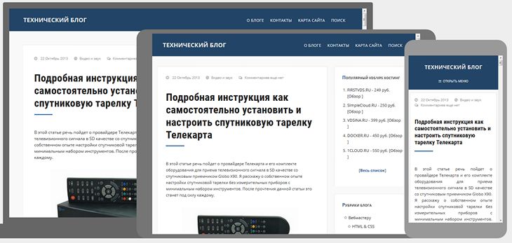
Good day to all, my friends and guests of my blog. Today my article will be rather short, but it does not lose its relevance today. Namely, I want to tell you about such a thing as google checking the mobile version of the site. And maybe I would not even have written such an obvious article if this check had not recently puzzled me.
Checking with google
Before, people didn't bother with responsive design or mobile. But then, when information appeared that search engines would lower the search engine results for sites that did not have a mobile version, the people strained themselves (as in the case of HTTPS). People immediately began to order mobile versions from freelancers, some installed special plugins that could work crookedly.
And so, when someone acquired an adaptive layout or a mobile version, they immediately checked it on a special Google service, which just looks at how your layout meets the requirements. Now the interface has changed a bit, but the essence remains the same.
To check this case for yourself, you need to go to this service - search.google.com/search-console/mobile-friendly... After that, enter the address of this site in the URL bar and wait. After a short time, you will be given all the information about whether your site meets the requirements of Google for mobile layout.

I do not understand...
I know perfectly well that my site has been adapted, especially since I only recently tweaked the layout. But recently, for fun, I went to this service to see what old Gosha would say, and was very surprised. The fact is that the service told me that my blog has never been adapted and is poorly readable for mobile devices.

I could not understand in any way what was the matter, so I started looking for a solution on the Internet. And I found it on one site. It turns out the whole thing was in the robots.txt file. I had it written in black and white so that search engines would not index my theme files, so he did not see any mobile version.

After I removed one line from the robot ( Disallow: / wp-content / themes / my theme), then the service immediately determined that my mobile version is normal. So don't worry if you suddenly have the same thing. Most likely, you simply did not allow Google to index your theme.
Well, on this I will probably finish my article today. I hope you found it helpful. As you can see google checking the mobile version of the site allows you to see how the site suits its requirements. But in fact, it's rare to find a website that doesn't have its own mobile version or responsiveness. A little more time will pass, and all newly created sites will automatically have an SSL certificate.
Thank you for reading me. I will certainly be waiting for you again on the pages of my blog. In the meantime, I recommend that you read other articles. I am sure that you will find a lot of interesting things for yourself. Good luck to you. Bye Bye!
Best regards, Dmitry Kostin.
Today there is no longer any need to convince anyone of the need for a mobile version of the site. After all, every day there are more and more visitors from smartphones and tablets. At the time of this writing, about 20% of my blog visitors are using mobile devices for browsing. That is, one in five visits my website from a phone or tablet.
Several years ago, I didn't even think about such visitors, but when their number exceeded 10% of the total number, I began to use a responsive layout. This made it possible to correctly display content on mobile devices and increase the loyalty of both visitors and search engines to the site.
The mobile version of the site and the responsive design are not the same thing. This article will focus on testing responsive layout when the design of the site changes depending on the screen resolution of the visitor's device.
To be sure that your site is displayed correctly on mobile devices, you need to check, and for this there are several useful services and tools.
Quick check of responsive layout
Popular Internet browser (browser) Mozilla Firefox equipped with built-in tools for checking the website design for suitability for display on mobile devices. To use it, go to "Menu" - "Development" - "Responsive Design". Or just press three keys on the keyboard at the same time ++ [M]
You should see something like the following:

By changing the screen resolution and orientation, you can check how your site will be displayed to mobile visitors.
Google Browser Chrome also has built-in support for checking the responsiveness of site design. To do this, go to the menu, select the "Additional tools" item and then "developer tools" (or press the key ).

After that, click the responsive design icon (or simultaneously click on the keyboard ++ [M]):

In the middle of the screen, you will see how your site will be displayed on the screens of mobile devices:

Mobile design SEO testing
As you know, the two world search leaders Google and Yandex have their own immodest opinion of how the site should look on the screens of mobile devices. And if the site is recognized as inconvenient for mobile visitors, then it goes down in the search results. So, from an SEO point of view, if you don't want to lose mobile visitors, then you must not only have a responsive design, but search engines must also consider it so, that is, suitable for mobile devices.
To check the adaptability using the Google service, go to the following address and type in the name of your site: https://www.google.com/webmasters/tools/mobile-friendly/.
This is what the result of checking my blog looks like:

With Yandex it is a little more complicated, for verification, you must register with the Yandex.Webmaster service and use the beta version of the interface:

Online services for testing adaptability
The main task of these services is to present (show) how your site will look on a mobile device. There are a lot of sites with such functionality. I will give just a few of them. In most cases, they duplicate the built-in functionality of FireFox and Chrome.
Google resizer
I'll start again with Google, which has its own responsive demonstration service: http://design.google.com/resizer/#
Quirktools screenfly
The second pretty service is http://quirktools.com/screenfly/. It will show you how your site might look even on TV!

Symby.ru adaptest
Well, in order not to offend the "domestic manufacturer" I will give an example of another site: http://symby.ru/adaptest/. On one page, you will see several views at once with different screen resolutions.

The speed of the mobile version of the site
After you have made sure that your site is responsive and displays correctly on the screens of most devices, you should check its speed. Again, applied to mobile visitors.
PageSpeed \u200b\u200bInsights
Google, as always, is ahead of the rest: https://developers.google.com/speed/pagespeed/insights/. This service will show you how the site looks on the phone screen and give recommendations on how to optimize the code to increase the loading speed on mobile devices.

WebPageTest
And in conclusion, I will give an example of a service that will not only show how the site looks on a mobile device, but also show the speed of its work: http://www.webpagetest.org/

conclusions
In my opinion, in everyday work, when making changes to the design of the site, it is easier to use the built-in capabilities of the FireFox and Chrome browsers. After that, of course, you need to check the loyalty of search engines to your design. And only then, to calm the soul or to show off, you can use online services.
Search engines strive to improve search results for users of mobile devices (smartphones, tablets), so sites optimized for different screen sizes will be displayed higher than sites without such optimization. This also includes mobile versions of sites.
Signs of a mobile friendly site:
- Conveniently readable content (read without magnification), large form fields and buttons.
- Lack of "heavy" pictures, Flash - elements and excessive animation.
- Lack of Java applets and Silverlight plugins.
- Lack of horizontal scroll bar.
- The minimum website loading speed.
- The most simple navigation.
- The viewport meta tag is registered.
Services for checking the site for "mobility"
To demonstrate how the services work, let's take the site of my good partners - the CONTEXT translation agency.
1. Google Mobile Friendly
You can check any site by simply typing its address into the line.
Displays on the screen how the site looks on a smartphone and gives an overall assessment of its optimization for mobile devices.
Unlike other services, here you can check not every site, but only your own. That is, after the site is added to the webmaster's interface with confirmation of the rights to it.
The service displays the overall rating, checks 6 points of compliance and shows how the site looks on a smartphone.

3. Bing Checker
The overall optimization is checked plus compliance with 4 points.
It also displays how the site looks on a smartphone screen (of course, on OS windows, while previous services displayed an android smartphone \u003d)).

4. Mobile Checker from W3C
The "longest" of all services. So "long" that I did not wait for the end of the test \u003d)
I waited for 5 minutes, while the rest of the services completed in 5-20 seconds.

5. Responsinator
Unlike the others, it does not give any ratings, but it displays how your site looks on 6 different devices in two orientations for IOS and Android, which is very cool.

UPD1: 07/20/2017:
6. Adaptivator
The service suggested in the comments to this article. I personally did not use it, but everything seems to be pretty good. The possibilities are similar to those of the responder, but there is also an assessment of the adaptability result.

UPD2: 3.11.2017:
7. iloveadaptive.com
Another brand new service suggested in the comments. As for me, a little overweight and impractical, but this is more than pays off with great opportunities. There is even sorting by OS.
Output
Undoubtedly, adaptation of the site for mobile devices is not just a tribute to fashion and time, but a necessary attribute of a modern site that helps not only the end user.
Therefore, for everyone who wants to be closer to the client and have more visits / leads, I recommend adapting their sites as soon as possible. Ask me a question -
For your projects, you probably noticed a long time ago that the number of mobile users is constantly growing. For some, the trend is less noticeable, and on some projects this figure doubles or more every year. According to LiveInternet data, more than 50% of the traffic on the Runet is accounted for by mobile devices. By the way, many readers of this blog have been complaining for a long time that there is no mobile version here 🙂 which will of course be fixed in the near future.
This fact of mobilization cannot be ignored by search platforms either. Gradually, they give advantages in mobile search to those sites that are adapted to users' devices.
At first, Google gave sites a mark in snippets that they would display correctly on mobile phones.

Also, Google has created a tool to help webmasters to check the correctness of the website display on mobile devices:
https://www.google.com/webmasters/tools/mobile-friendly/
On April 21, Google launched a new algorithm called Mobilegeddon in the West. Now passing the Mobile Friendly test is one of the SEO factors taken into account by Google. So far, there have been no major changes in the SERP, but you can prepare now.
How do you make a website responsive for Google? The secret is simple - you need to set a task for your programmers / layout designers. Well, if there is no time to wait, then ... you can use MobileCheat 🙂
In fact, this is an untested technology, it is not known what it will lead to in the future, so use it only at your own peril and risk. At least a series of tests can be done here.
How to bypass Google Test with MobileCheat
There are only two things to do:
1. Add the viewport meta tag to the code.
2. Close the robot access to CSS files or the folder where they are located through robots.txt
For example, this is how my blog passes the default test:

When closing the CSS, the picture changes:

It seems that nothing has changed on the site, but the test results are completely different. By the way, on some sites I myself like to disable CSS, so that it is more convenient to view and use them 🙂 therefore, this is a completely justified scheme. But it is presented for informational purposes only.
What do you think about this? Will Google count it as a counter move with a knight or has it thought out everything in advance and will immediately check and checkmate the site? 🙂