RAW is translated from English as "raw, unfinished". If in ordinary life this quality cannot be considered a plus, in digital photography the “raw” format is the most perfect. Only the most serious digital cameras allow you to save images in RAW in order to defer some of the important settings until the stage of processing and get the most out of your photography equipment.
What is RAW
While the universal image formats JPEG and TIFF can be considered the digital equivalent of a slide (or final print), RAW is an analogue of a film negative. "Semi-finished product", involving various options for further processing, during which one or another result will be obtained.
To understand the meaning of the "raw" format, it is worth going for the opposite. When using JPEG, a picture goes through five stages: capture of an analog signal by a matrix, conversion to digital form (analog-to-digital converter), color interpolation, processing in accordance with camera settings, and lossy compression. Half of the settings are found in any cameras, including film cameras (exposure, ISO sensitivity, metering method, autofocus operation). The rest of the settings are related to the JPEG format: * Color rendition. Various options ("lively", "rich", "natural colors"). Monochrome shooting modes. Correction of RGB color components. * White balance. If the photo comes out blue or red, the wrong White Ballance setting has been selected. * Brightness and saturation. * Microcontrast. Figures under the English word sharpening or Russian "sharpness", although it has nothing to do with real sharpness. * Compression ratio. Variants such as "super-fine" really mean that losses are kept to a minimum.
The digital "negative" is recorded on the card immediately after the stage of digitizing the analog signal. Its use allows you to postpone all these settings until the stage of processing on a PC.
Color interpolation
A typical matrix of a digital camera consists of cells located on the same plane that respond only to brightness, forming a monochrome image. To obtain color information, Kodak engineer Bruce Bayer 20 years ago suggested installing a filter in front of each cell of one of three colors - green, red and blue, which combine to give the desired hue. This technology is used to this day. For each cell with red and blue filters, there are two with green, since this color contains basic information about brightness.
After being digitized, the picture is composed of red, green, and blue pixels. Such an intermediate image is unsuitable for direct work. In order for each pixel in the output to have a natural tint (that is, to include all three color components), the camera processor or RAW converter sums the color of neighboring pixels, for which a complex color interpolation algorithm is used.

Depending on the manufacturer and the specific DSC model, the RAW file may contain data both before interpolation and after (before the final processing stage). Most modern digital cameras use the first approach, as RAW conversion programs almost always offer better algorithms. In addition, they are constantly being improved, and the camera processor can be changed by purchasing a new one. Improvement of in-camera JPEG algorithms is developing in parallel with the improvement of matrices. It is this that often determines the advantages of new models over their predecessors - for example, Nikon D40 DSLRs over D70.
Same sensor, but the D40 is a more recent model and therefore offers better JPEG quality. But even better quality can be achieved with the D70, if you ditch the JPEG format at all!
"Raw" quality
There is potentially always more information in the RAW file than in the final one. RAW converters use this data in various ways. Some are better suited for handling underexposed shots, while others "squeeze" the most out of those taken with optimal settings.
Typically, an ADC (analog to digital converter) provides a color depth of 12 bits. There are also more advanced exceptions: Canon 40D (14 bit), Fuji S5 Pro (14 bit x 2), Pentax K10D (22 bit). When shooting in JPEG format, we get regular 8-bit files, immediately suitable for printing. "Superfluous" information is used by the processor to compensate for the disadvantages of the digital matrix (narrow range of brightness, noise). But even in the most powerful and advanced models, "extra" information is not 100% used. RAW stores all the information that the ADC unit gives, including the original bit depth (color depth).


Once the files are copied to your computer, you decide what to do with the 12-bit data. 12-bit RAW enables safe exposure compensation within two exposure stops on each side. Using the exposure compensation tool in the RAW converter (by simply moving the slider), you shift the working area of \u200b\u200bthe final file (8-bit). If your camera is slightly mistaken in its exposure settings, this will pull out shadows and highlights without any of the tonal distortion or other side effects that come with serious tonal correction.
If the exposure is initially determined accurately, due to the higher bit depth you can get deeper, more detailed images by converting raw files to TIFF format with 16-bit color. The bit depth of RAW allows you to use this format to obtain photos with a high dynamic range - High Dynamic Range (HDR).
Variety of formats
If the RAW format was the same for all manufacturers, it would be very convenient in terms of software compatibility. In history, there have been attempts to create a universal digital negative standard, similar to JPEG and TIFF. The most successful of them is the Digital Negative (DNG) format from Adobe, which has found application in some modern digital cameras (Leica M8, Pentax K10D, Samsung GX-10). However, this is an exception to the general rule.


Not only does each manufacturer promote its own standard for raw files (CR2, NEF, PEF, variations with the RAW extension), but also within the line of one manufacturer the formats do not coincide: as a rule, a software update is required for each new generation of digital cameras.
Formats differ not only in terms of data structure. Manufacturers sometimes save space on memory cards by using raw data compression (for example, as in the case of Nikon Electronic Format). In theory, this compression can result in a minor loss of quality. In practice, there are no even minimal losses. The only drawback is that the compression process itself takes up resources and can affect the speed of recording images. Pentax Raw Format (PEF) takes the opposite approach.
When not to shoot RAW
The RAW format provides the best quality and the ability to make even not the best pictures something that pleases the eye. But there are several situations when shooting in RAW is impractical: insufficient memory card capacity, continuous shooting (on some "slow" cameras), household shooting, direct printing, lack of personal time for image processing.
© 2013 site
At the time of this writing, I am using the Adobe Camera Raw plug-in version 7 that comes with Adobe Photoshop CS6. This is the first version of Adobe Camera Raw (ACR), where fully automatic chromatic aberration correction is humanly implemented, which is very important to me. I find earlier versions of ACR unacceptable and used DxO Optics Pro as my main RAW converter before Adobe Camera Raw 7. DxO does not have a very user-friendly interface, but it provides excellent RAW file conversion quality, which Adobe was only able to come close to in 2012. Since the ACR interface is more convenient for me, I, having appreciated the merits of the seventh version, changed the converter.
If you are using any other RAW converter, try to follow the analogy with what is written in this article. The general principle of operation of all converters is the same, and they differ, by and large, in details. Among the popular converters, in addition to Adobe Camera Raw, I can recommend DxO Optics Pro and Phase One Capture One PRO. converters from photo equipment manufacturers - Canon Digital Photo Professional and Nikon Capture NX do an excellent job of converting images taken with Canon and Nikon cameras, respectively, but have an extremely inconvenient interface. The widespread Adobe Lightroom works on the Adobe Camera Raw engine, and therefore does not differ from the latter in the conversion quality.
When choosing a RAW converter, make sure that the images converted with it are not worse in quality than the JPEG obtained by the camera. In recent years, intra-camera conversion has provided (with the correct settings) such good results that often shooting in JPEG is preferable to inept processing of a RAW file in a not very fresh converter (see "RAW or JPEG?").
Let's look at the basics of processing RAW files using the example of a photo of a picturesque valley in the Skole Beskydy. Let's open the file in Adobe Photoshop, and the Adobe Camera Raw window will unfold in front of us. The raw landscape, as is always the case with RAW files, looks pretty washed out, but we'll fix it soon.

At the top left is a panel of the most commonly used tools from the point of view of program developers. I usually have a loupe ( Zoom tool - key Z) or hand ( Hand Tool - H key or held down space bar). In the upper right corner you can see a colored histogram, and below it are the tabs of groups of tools for editing images.
If you open several RAW files in ACR at once, then on the left you will see them as a row of icons. Camera Raw supports batch processing of files, i.e. by selecting several images, you can change various parameters at the same time for the whole package. You can also apply uniform parameters to all open files based on an already edited sample using the Synchronize function.
Before starting to work with Adobe Camera Raw for the first time, you should configure some plug-in settings so as not to be distracted by them in the future.
Customizing Adobe Camera Raw
First of all, open the ACR settings dialog. It can be found in the top toolbar (third button from the right) or called by pressing Ctrl / Cmd + K.
In chapter General, in the Save image settings in item, select where the processing parameters for each edited image should be saved - in separate .xmp files (Sidecar “.xmp” files) or in a special database (Camera Raw database). I prefer the first option i.e. after saving the work results, the program creates an additional settings file with the extension .xmp next to each RAW file, into which it writes all the changes made. In the case of a database, all information is stored centrally, which is inconvenient for me. In both cases, the RAW file itself is not subject to any changes, and therefore you can always go back during the editing process, or even reset all settings and start editing again. Also, a factory reset occurs when the .xmp file or ACR database is deleted.
In chapter Default Image Settings uncheck all the boxes to prevent the program from correcting images without permission.
In chapter Camera Raw Cache specify the maximum amount of temporary files acceptable for you (at least 1 Gb) and the folder where they should be stored (preferably not on the system drive).
Section DNG File Handling you can leave it alone, but in the section JPEG and TIFF Handling Disable JPEG and TIFF support (Disable JPEG support and Disable TIFF support), as these formats are best handled directly through Photoshop.
Save the settings by clicking "OK".
At the very bottom of the Adobe Camera Raw window, in the form of a blue underlined link, there is a description of the workspace that will be assigned to the image after you finish working in ACR and open it in Photoshop. Click on the "link". In the window that opens, check the following points:
Try to avoid clipping in highlights by constantly monitoring the histogram. By pressing the O key, you can turn on the clipping highlights warning. Clipping shadows is acceptable a lot more often, but also requires care.
Contrast - contrast. Controls the overall contrast of the image using an S-curve, modifying the difference in brightness between the darkest and lightest areas. I rarely use Contrast values \u200b\u200bgreater than +25, and now I will not touch it at all.
The following two tools work in tandem to selectively control the brightness of highlights and shadows:
Highlights - Sveta. Helps show details in overly bright lights. I'll put -50.
Shadows - shadows. Brightens shadows like a fill flash. +25 will be enough.
The next pair of tools works even more narrowly, affecting only the extreme points of the histogram, which is sometimes necessary to combat clipping, or, conversely, with a lack of contrast:
Whites - white point. I will move the edge of the histogram to the right by +30, although more often I use negative values.
Blacks - a black point. I'll leave it unchanged - black is already in its place.
Experiment with the Highlights / Shadows and Whites / Blacks to see how they differ from each other.
Clarity - clarity or local contrast. Clarity is the most useful tool because in many scenes you have to deal with a lack of local contrast, while the overall contrast is fine, or even excessive. But be careful, it is easy to overstep the mark in the pursuit of detail and get unnatural halos around objects. I usually do not exceed the Clarity +50, but today I will make an exception and put +75.
Vibrance and Saturation control the color saturation. The difference between them is selectivity. While Saturation increases the saturation of all colors indiscriminately, Vibrance works more delicately, increasing the intensity of only the least vivid colors. I'll set it to Vibrance +50 and Saturation +15, which is pretty much. More often, you have to use lower values \u200b\u200bin order to then selectively increase the saturation of only individual color channels.
Often, after I've tweaked all of the Basic tab tools, I go back to the white balance sliders to adjust for any changes in brightness, contrast, and saturation that might have affected the color balance.
Here's what we got at this stage. You can compare the processing results with the original image by hovering over the image.
I am not happy with the sky - it is too light, has an unnatural brightness gradient from left to right, and its color is not intense enough. In addition, I would like the mountains closest to us (left and right) to look a little more contrast and relief. I'll work on the mountains later in Photoshop, and a gradient filter ( Graduated Filter - G key). It is an imitation of a real gradient filter, but has a wide variety of adjustable parameters.
First of all, to shade the top left corner, I'll apply a diagonally oriented gradient filter with the following parameters: Temperature -10; Exposure -0.50. Then, across the entire sky, from the top edge of the photo to the horizon, I will stretch another gradient with the parameters: Temperature -20; Exposure -0.50; Contrast -25; Highlights -25; Clarity -50; Saturation +15.
Note that the gradient filter allows you to selectively change the color balance in specific areas of the image, which is useful if, for example, you want to warm up the landscape while keeping the sky cool and blue.
Since I started working on gradients, I will add, perhaps, another one at the very bottom of the photo in order to make the water in the river bluer and the grass on the near bank more green. The only parameter is Temperature -20.
Compare the image with and without gradient filters.
To influence image areas with complex boundaries, it is advisable to use not a gradient filter, but its analogue in the form of an adjustment brush ( Adjustment Brush - K key).
Tone Curve Tab

Here you can finely adjust the brightness and contrast of the image using curves. I rarely use curves in Camera Raw because I usually get enough of the Basic tab capabilities.
Detail tab

This tab is responsible for sharpening ( Sharpening) and noise reduction ( Noise Reduction). I prefer sharpening in Photoshop, and therefore I turn off sharpening in ACR by setting Amount to 0. With suppression moderate noise, especially chromatic, ACR copes quite well. As a rule, I use the following parameters: Luminance 25; Luminance Detail 100; Luminance Contrast 100; Color 50; Color Detail 100. The first three parameters are responsible for achromatic (brightness) noise, the rest - for chromatic (color) noise. When suppressing luminance noise, be very careful not to get a blurry picture. When working with the Detail tab, always view the image at 100% magnification, otherwise you will not see what is happening with the small details.
HSL / Grayscale tab
An irreplaceable color correction tool. The HSL / Grayscale tab is designed to work with individual colors and includes three sub-tabs:

Hue - shade or tone. Here I will move Oranges to the left by -10 to make the clay on the bank more red, and Aquas to the right by +10 to make the lower sky area look fresher.
In general, I observe that Adobe Camera Raw tends to make the image a little more yellow-green than I would like, and therefore I have to correct individual shades one way or another. If you are personally happy with the ACR color rendering, you can leave the Hue subtab alone.

Saturation - saturation. To improve the look of the clay, I'll set the Oranges slider to +25. Often I increase the saturation of the Blues, but in this case I solved the sky and water color issue mostly with gradient filters.

Luminance - lightness or brightness. I will make the sky a little darker by moving the Blues slider to -15.
The Split Toning tab is for toning black and white photos and we will skip it for now.
Lens Corrections Tab
Here you can correct lens aberration as well as perspective distortion. There are two underlays - for automatic and for manual correction:

Profile - automatic correction of lens aberrations based on a special profile. Profiles for most popular lenses come standard with Adobe Camera Raw. To enable automatic correction of lens distortion and vignetting, check the box next to Enable Lens Profile Corrections. I recommend doing this only in cases where distortion or vignetting is visible to the naked eye, since removing distortion leads to a slight deterioration in sharpness, and vignetting is not even always a disadvantage. In the case of our example, everything suits me anyway, and therefore I will only tick the box next to Remove Chromatic Aberrations. Chromatic aberration elimination works perfectly in ACR 7 (which cannot be said about earlier versions), and I always use it, especially since it helps to improve sharpness at the edges of the frame.

Manual - manual correction. Here you can correct the blocked horizon and distortion introduced by perspective. In my shot, both the horizon and perspective are fine, so I'll leave everything unchanged. If you will be working in manual override mode, I advise you to turn on the grid by pressing the V key, so that you can better see both the distortion itself and your edits.
At this stage, I usually use the Crop Tool (C key) if the standard 3: 2 aspect ratio does not suit me, or if the edge of the photo has captured some foreign objects. No cropping is required now.
Effects Tab

There are only two effects: grain ( Grain) and vignetting ( Post Crop Vignetting). I'll leave the grain for lovers of pseudo-antique photographs, but moderate vignetting can beautify many pictures. I will slightly shade the edges of the image by setting the Amount to -15.
So, we went through all the functional tabs. You are already familiar with the Camera Calibration tab, but there are still two additional tabs:
Presets Tab
You can save all the changes that you made to the image as presets, which can later be applied to any other images.
Snapshots Tab
Snapshot means snapshot. This is the same as preset, but only within the same RAW file. In other words, you can create several processing options for the same photo (for example, color and black and white versions), then work with each option individually.
This completes the editing process of our landscape in Adobe Camera Raw. I will be doing the finishing work using Adobe Photoshop.
By clicking "Open", you will open the image for further processing in Photoshop, and by clicking "Done", simply save the results of your work in an .xmp file.
I suggest you compare the photo processed in Adobe Camera Raw with the original version.
Thank you for attention!
Vasily A.
Post scriptum
If the article turned out to be useful and informative for you, you can kindly support the project by contributing to its development. If you didn't like the article, but you have thoughts on how to make it better, your criticism will be accepted with no less gratitude.
Please be aware that this article is subject to copyright. Reprinting and quoting are permissible provided there is a valid reference to the source, and the text used should not be distorted or modified in any way.
I was asked many times to write about the processing of RAW files by novice photographers, but I thought that a lot had already been written about this by other authors, and then a good person asked me again, so I share my knowledge and experience.
RAW File
If you are still shooting in Jpgthen know that this is a pathetic excuse RAW file in terms of the ability to extract useful information for the photographer. RAW the file is in fact almost raw data that has not undergone (should not at least) be processed with white balance, correction, and other things. AT RAW File shadows stretch better and overexposure is better compensated. That is why it is best to shoot in RAW, and do not write additional jeepgs to the memory card, because:
1.you can always make it from RAW
2.it takes place
3.It slows down shooting by overflowing the buffer in the camera when writing to a memory card (more than one RAW, and also a jeep)
Despite the fact that RAW the file is essentially raw data, it is not so simple when you open it in a RAW converter. It comes with a trailer. Distortion, vignetting and noise reduction profiles are often embedded in the file. Probably, the discoverer of such a petty "fraud" can be considered Sony, for which files began to work with noise reduction from certain ISO values. She was followed by FUJIFILM and made the situation worse. You open RAW file in Adobe camera raw (hereinafter ACR), and there is no longer distortion and vignetting, and often the noise is "suppressed". This is probably good for a beginner photographer who does not want to learn photography, but wants a "click-and-click" and bad for someone who is trying to figure out which ISO is better to shoot and what characteristics of his lens.
RAW converters
A RAW converter is a program that decrypts (I write in simple words) the original data in the correct way and shows us visually, in the form of a picture.
In fact, the data can be decoded in different ways and therefore the result is slightly different for different RAW converters. The most famous and most "advanced" is, of course, Adobe camera raw... It understands DCP color profiles, has many controls for perspective, distortion, vignetting, color change, and noise and sharpness. Promoted by the giant of the graphics market - the company Adobe, so what you want - you don't want to, and everyone else has to be guided by it in one way or another.
Here everyone who uses a different RAW converter (from experienced photographers) will be indignant, remembering their undeservedly "forgotten" Capture One or RPP, but fact is fact - ACR more powerful, simpler and faster.
However, this favorite of RAW converters isn't all that perfect. An important point with him is that he uses all these "add-ons" that the camera manufacturer hangs up to its RAW file format and turns them on without notifying the user and the possibility of turning them off. To understand how this happens, you can watch. AT ACR there is no noise and everything is somehow smooth. But when you open it in another RAW converter, it turns out that there is actually a lot of noise. In fact, when opening a file of this camera in ACR, automatic noise reduction, correction of distortion and vignetting occurs. Software by itself.
Why do I, like 90% of other photographers, use Adobe Camera Raw? The answer is simple - this program has a large corporation behind it and will develop further, while others, including very promising RAW converters, are held together by one person. When he gets bored, he will simply drop the project and you will be left without your favorite tool. Therefore, let's talk about the possibilities Adobe camera raw.
Adobe Camera Raw features
I use a standard photo cataloging tool, Adobe bridge... It is closer to me in ideology. This is a full-fledged tool just to flip through, rate photos, view shooting parameters, etc. Nothing extra. For those who want a "combine" there is Adobe lightroomwhich also uses ACR, but the ideology there is from streaming photography.
First, update your ACR to the current version. It is updated quite frequently and some features appear that were not present in older versions.
As you can see, there are three important controls for the RAW development process:
1.main panel
2.support panel
3.bar graph
Basic parameters / Basic

White balance
The first thing we do is set the white balance. Well, if we know him, the camera guessed him, or we used the color scale.


Select the gray eyedropper and click on the gray patch, third from the left. It is a medium gray neutral color. This will give us the most accurate white balance.
If there was no scale in the test frame, then use the standard settings in the “white balance” menu or move the white balance sliders until you like the model's skin color. Also, there may be something neutral gray in the frame, which you can poke at with an eyedropper, assuming that it is gray. Such help occurs from time to time.
For example, in the shot where the girl is sitting on the couch behind her back, there is an ideal “gray card” of gray and black stripes. But keep in mind that objects that at first glance may appear gray, in fact, can easily have a bluish or beige tint and then you will not be able to use them as a calibration element.
bar graph
Now you need to make sure the overexposure and underexposure indicators are on. To do this, check that small triangles are included (circled) on the histogram, as in the example.

Now, if my picture is incorrectly exposed or too high-contrast, overexposed areas will stand out in red and underexposed areas in blue.

Places highlighted in blue have a color value: 0, 0, 0

Places highlighted in red have a color value: 255, 255, 255
You should avoid both, unless it's a catalog shoot where the background needs to be pure white or black.
Exposition
If you have a small general error in plus or minus, then use the "" slider.

Contrast
It is sometimes useful to increase the contrast of a photo to get a brighter color. This is the most effective way to enhance your photo without spoiling it (if you increase the contrast within a reasonable range).

"Sveta"
"Light" is not white. But close. And you can lighten them to white or darken to gray.

In this photo, the main "lights" have accumulated on the white shirt and the "mouse" that is on the table.
They could have gone into "overexposure", but the exposure here is ideal and therefore they are exactly as they should be - on the edge.
"Shadows"
"Shadows" is the whole jumpsuit, stripes on the wall, under the sofa, etc. There are a lot of shadows in this image, and they provide a great contrast to the light wall and white shirt.

The shadows could be highlighted with this slider, but I implore you to use it. In the shadows lives a terrible beast - "noises". Any area of \u200b\u200bthe frame where there is little light is a potential source of "noise". Many novice photographers believe that absolutely everything should be visible in the photo. This is not true. "Everything is visible" is equivalent to "nothing is visible." The photo should have a subject emphasis and minor areas. These are insignificant ones and should go into the shadows, setting the general contrast in comparison with the light main character of the picture.
If you lighten the shadows, then you draw out "noises" from there and then you have a crazy task to destroy the monster that you yourself created.
I have a relatively new Canon 5DsR camera, so shadows stretch well and there is little noise. I had to raise the exposure 2 stops to see them.

These green and purple dots are "noise". You don't need to deal with them, you need to avoid them with competent shooting and competent processing. And if we go nowhere without it, then we will reach the "noise reduction" tab.
"White"
The "white" slider is needed much more often than the "shadow" slider. often allows a slight movement to avoid overexposure in the frame if it is not critical.

How much you can get the shot out of local overexposure depends on your camera. Although modern cameras improved their performance in this regard around 2008, underexposure is not so bad compared to overexposure. Simply put, "overexposure" is almost always the impossibility of saving a photo, there is little stock there. But if you shine a little, you can pull out something, albeit with noise and dirty flowers. This applies to all cameras, do not think that you have any special one. I tried the newest and Sony A7R II... Miracles do not happen :)
"The black"
Sometimes you need to increase the contrast of an object that has white areas. We raise the contrast by lightening the white and darkening the black. If we cannot touch the white one, then we will darken the black one. This is what this slider is for. You can also remove black from the entire frame, but I can't imagine a case when this might be needed throughout the frame, except locally, but this slider works throughout the frame.

When working with this slider, make sure you have the underexposure indicator on the histogram turned on. This will avoid "knocking out" areas in black that you would not want to see as a completely black spot.
Microcontrast / Clarity
Micro contrast behaves like a rough sharpening. Of course, he does not add sharpness, but adds the illusion of sharpness.

Use very carefully or do not use at all. There are much more gentle methods of sharpening visuals, including during RAW development (let's get to that).
"Nuclear Color" / Vibrance
Literal translation - resonance. I call it "nuclear color" because it just disfigures all colors. After such an intensification of colors, it is simply impossible to look at them.

Most often, lovers of this slider "pierce" on objects to the color of which our eyes are especially sensitive: the sky and grass. You know all the colors of the sky if you are not a permanent resident of the metro. It's the same with grass. The grass color error is very easy to recognize. The wrong color of the grass and sky is rejected by most viewers. Forget this slider!
Instead of this slider, use "Contrast" and another tab called HSL / Grayscale (more on that later).
Color saturation
The impact of this slider is almost as devastating as the previous one. In fact, all three of the last sliders are harmful.

Harmful, because they give the appearance of an easy achievement of the result and the beginner thinks that everything is ok. But in fact, he spoils his initially good photo with poor processing. It would have been better if I hadn't done anything then.
If the colors in your photo are too faded, then there is usually a reason that led to this during the shooting. Accept that this shot is marriage. Establish the reasons for such a marriage and try to shoot better in the future. There is no need to take a piece of G. and try to squeeze out of it what is not in it. To get a great picture, you must first take at least a good picture, and then process it with high quality and minimal processing. This does not mean repaint it completely! As a rule, all processing consists in removing dust, increasing contrast and correcting some small geometric defects. All! You are a photographer, not a retoucher. Leave retouching to professionals.
Align and crop a photo
Here I will have to make a small digression from the "Main panel" and spread over to the auxiliary one. The fact is that after aligning minor flaws in the photo, I want to align the horizon as well. Those. neither the person nor the horizon in a landscape photo should lurch to one side. But some shots always come out tilted, especially when you're passionate about the subject.
In this case, I was lucky and there are vertical lines on the wall. It is highly likely that they were glued exactly vertically and the wall is flat.
I will select the Ruler tool, click anywhere on the line that should be vertical and extend it down or up.

The picture will rotate a little, correcting its position and you will see the line of the supposed crop of the photo. On this line, you will also see controls - small squares, by which you can drag and offset the crop line.

The control squares are marked with red arrows.
In this case, I don't like the second layer of curtain at the top, I will omit the crop line. I will also move the left line to the right to cut a wire on the floor and some kind of box. It would be possible to restore the floor in this place if I really needed a whole picture, but this is no longer a job for beginner photographers and therefore does not apply to the topic.

I press Enter and the excess is cut off from the picture. In fact, physically nothing was cut off. we are working with a RAW file, but the XMP file, which is now attached to the RAW, has been changed by our settings. Now the snapshot will open like this ...

If we now leave the work with the RAW File by clicking "Finish", then later we can always go back and undo the crop by selecting the Crop tool (indicated by the red arrow) and pressing Esc.

If you didn't need to align the image, then you can always simply crop the image to the desired proportion using the Crop tool right away.
Now, with a clear conscience, we return to the "main panel".
Second Tab - Tone Curve
This tab allows you to work with the Adobe Photoshop Curves tool. It's a very flexible tool and it's great that you can use it even before getting into Photoshop itself, because it is not destructive. You can always undo these changes. And changes with the help of "curves" can be very global. There is both just lightening and darkening pixels of a certain brightness, as well as working in color channels.

If in the Basic tab we did not have settings for "highlights", "shadows", "white" and "black", then there are special controls that limit the action of the slider. What range of brightness are considered shadows and what are highlights? You yourself determine this by the points indicated in the picture with red arrows.
If you do not change the standard settings, then the sliders for "light", "shadow", etc., which I circled in a red frame, will work in the same way as in the first tab.
I deliberately shifted the control points and in the area circled with a red circle you can see that the range of highlights that I influenced turned out to be quite small.
There is also a second tab called Point. It provides the most flexible curve setting. There is nothing difficult here, but be careful when working with a curve. More often than not, the light and shadow are distributed more or less normally, so if you drag the light into white, you can lose color, and "noise" can come out of the shadows. At the same time, such a curve can be very useful to you, for example, when processing underwater photographs, where the red channel is usually quite bad. You can create yourself a profile setting that will weaken the green-cyan and enhance the red and apply to all photos. Plus, again, this is not a destructive technique, your settings are all saved in a separate file.

I marked the drop-down list with a big arrow, where you can select the standard settings "linear contrast" (by default, the curve is linear), "medium contrast" and "strong contrast".
You can switch linear-medium-strong to see how they are achieved. The curve becomes a sinusoid, darkening shadows and brightening highlights.

Based on this knowledge, you can decide for yourself what to lighten or darken. You need to do this for all channels or for just one.

This feature is not included in the list of simple functions (especially when working with separate color channels), so if you do not understand something, do not worry, you will understand it later when you really need it.
Detail tab
The detail tab is responsible for visual sharpening of the photo and for the ill-fated "noise reduction".

Sharpening
The first menu with red arrows is visual sharpening. Obviously, we cannot take additional detail in a shot from nowhere, but we can always make the viewer's brain think that the photo is sharper than it is. For this purpose, a well-known (but no less surprising) method of processing image contours is used (the method is also called contour sharpness in Russian), where the contour itself is darkened and outlined on both sides with a white line (to put it in simple words again).

With the strength of the effect, everything is clear, the more - the stronger the effect of enhancing visual sharpness. There is a threshold at which artifacts begin to emerge. Try not to overdo it on the strength of the effect, find the right radius for your photo size and detail size and then increase the strength of the effect.
The menu item "small details" / Detail makes it possible to enhance the texture in the photo, and small values \u200b\u200bof this parameter make it possible to work only along the edges.

The item "Mask" makes it possible to focus on sharp contours, applying the enhancement method to them. Here it is worth paying attention to the fact that all menu items have a visual mode if you hold down the ALT key and move the sliders.

Noise reduction
I lighten the shadows using the Shadows slider from the first tab and by itself I get noise where there were shadows. I start by analyzing this noise. The fact is that noise is divided into two types: luminance and color. Luminance points are points of different brightness, randomly distributed throughout the image. You can't really do anything with them, just blur the picture a little. The picture will be less sharp, but the dots will be less visible. Brightness noise is common at very high ISOs when shooting.
Colored noise is always present in the shadows at any ISO. It is they that appear when you lighten the shadows. They look like colored purple, green and red dots, arranged in a chaotic manner.

Accordingly, the arrows mark the sliders that allow you to deal with different types of noise.
Right now we are only discussing work in RAW converter, but you should know that besides RAW converter there are many more ways to deal with "noise".
There are plugins for Adobe Photoshop, eg, Imagenomic noiseware or Topaz denoise... Both are considered good options for noise suppression when you have a difficult case.
There is also a technique Multishotwhich helps when shooting with a tripod. You take a series of shots at a high ISO (for example, shoot a starry sky at a short shutter speed, because on a long star they already turn into tracks), then add the shots and only stationary objects remain in the shots. Noises are a chaotic thing, therefore they are subtracted from the picture in this case. I think it will be important for you to know that there is such a method.
HSL / Grayscale
Tab HSL / Grayscale controls the ranges of colors. HSL is a color description model and stands for Hue / Saturation / Lightness (Color / Saturation / Brightness). Any color can be described with this model.
You can select a range of colors and change their color, color saturation and brightness. It is very effective and neat when used skillfully.
Hue (Color)

The last two lines made it difficult for me to translate the color. both of these colors in Russian are purple :) But in English purple are divided into three types.
Thus, by dragging, for example, the red slider to the right, I get not a brown, but a red table.

Please note that when recoloring, a rather narrow range of colors was captured, the floor remained brown. This happened because the computer knows that the floor only looks brown, but in fact it is closer to orange. If you touch the orange slider, the floor will immediately start repainting. In any case, all the colors in the image are in one of the ranges from this list.
Saturation

Here you can enhance any color. In this case, I pulled the red slider and even the lips shone with new makeup.
Lightness
By varying the brightness of a small range of colors, good results can be achieved. I use this tab from time to time to make the light blue sky darker without affecting its color. You can make it darker and lower the saturation. It looks like the real color of the sky.

I recommend not raising the saturation, but only decreasing it when needed. It is also useful when Adobe camera raw does not handle red correctly. You can lower the saturation and get a softer skin tone.

In this case, I darkened the orange colors, making the girl tan.
Split toning
Tab Split toning literally translated as "separate toning" and its essence is to color the light in one color, and the shadow in another. For example, the lights are warm and the shadows are cold. This tool was not introduced by chance, and why it works can be understood from the article in its part
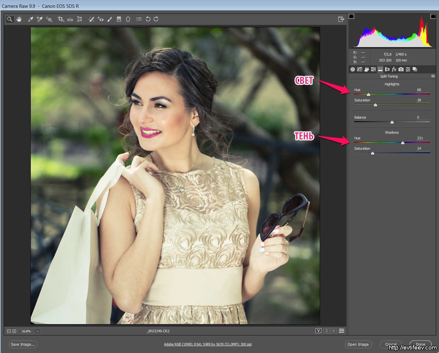
With the help of the color slider, we change the color of the highlights or shadows to the desired one. Usually, warm toning is used for highlights, and cold toning for shadows. Next, you select the saturation of this toning with the "saturation" slider. Between adjusting the toning of highlights and shadows is a slider for the balance between these actions, i.e. what actually counts as lights and shadows.
Example

To your taste, of course, the picture needs toning or not. Sometimes toning saves a mediocre shot and this is very often used by photographers who shoot weddings.
To cancel the effect, it is enough to set the saturation sliders to zero.
Lens Corrections
This tab is intended to eliminate the effect of lens imperfections on the image. In this fragment, you can see if you look closely in the form of purple borders on white vertical elements.

Here you can see the items for automatic correction of the effect of a particular lens in the Profile tab.
Remove Chromatic Aberration - removal of chromatic aberration.
Enable Profile Corrections - correcting the effect of lens imperfections using a profile (correction, distortion and vignetting)
There are a lot of photo lens manufacturers of all brands in the drop-down list.

You can turn on corrections separately, as well as manually additionally correct distortion (initial value 100%) and vignetting (initial value \u003d 0) using the sliders just below if you turned on automatic correction using the profile.

Additional corrections for distortion and vignetting are indicated by red arrows.
Effects - FX
Next tab Effects accordingly refers to special effects.

We are offered three types of effects:
DeHaze - elimination of haze
Grain - grain
Post Crop Vignetting —
You can now see the influence of DeHaze in the image in the form of high contrast and increased color saturation.
Influence Grain (grain) looks like natural film grain. Can help create the appearance of a film shot.

With additional vignetting, you can add emphasis to the center of the image, which is useful for not very good portraits. In any case, this is another tool for adding visual volume to the image (a large light spot against the background of a darker environment attracts the viewer's eye).

The vignetting function has a lot of settings, but I won't dwell on all of them.
The main ones are: the strength of vignetting (amount), removal from the edges (midpoint), roundness (roundness), feather (feathering)
Camera Calibration
This is where the color profile for the camera is set.

Top tab Process shows us that the style of working with color Adobe camera raw changed three times, so if you suddenly open your old files, you can find an exclamation mark in a triangle in the lower right corner of the picture. This means that the old process was used and if you click on this mark, the color process will be updated and the image will slightly change its appearance.
Next, you see a menu Camera Profile... The point is that the camera can be calibrated in terms of color rendering. This requires a color scale like X-rite Colorchecker... Canon turns red and Nikon blue is a thing of the past. In addition, you can connect your own profiles here for special needs. For example, I've connected an infrared color profile that allows me to colorize my infrared images with no color temperature limit.

Presets
Tab Presets (settings) contains a list of your settings for White Balance, Crop, Contrast and Sharpness settings, etc. from past photo shoots.


The red arrow indicates how to get to the menu for saving, loading or applying presets.
The menu for saving image settings looks like this ...

A wide choice of what from the settings you want to save and what not.
Snapshots - snapshots of settings
In the process of adjusting the image development, you can find some good solutions, save them and then continue experimenting with the ability to return to the saved settings. This tab implements this feature. Customize the snapshot as you like, then click New (indicated by the red arrow) and name your settings snapshot.

After that, you can change the current settings as you like. When you get bored and you decide that the old settings were better, you go to this tab, click on the name of the settings snapshot and your snapshot miraculously returns to its previous view.
Auxiliary panel
I called the top panel auxiliary because it has to be used less often, in the picture it is in a red rectangle.
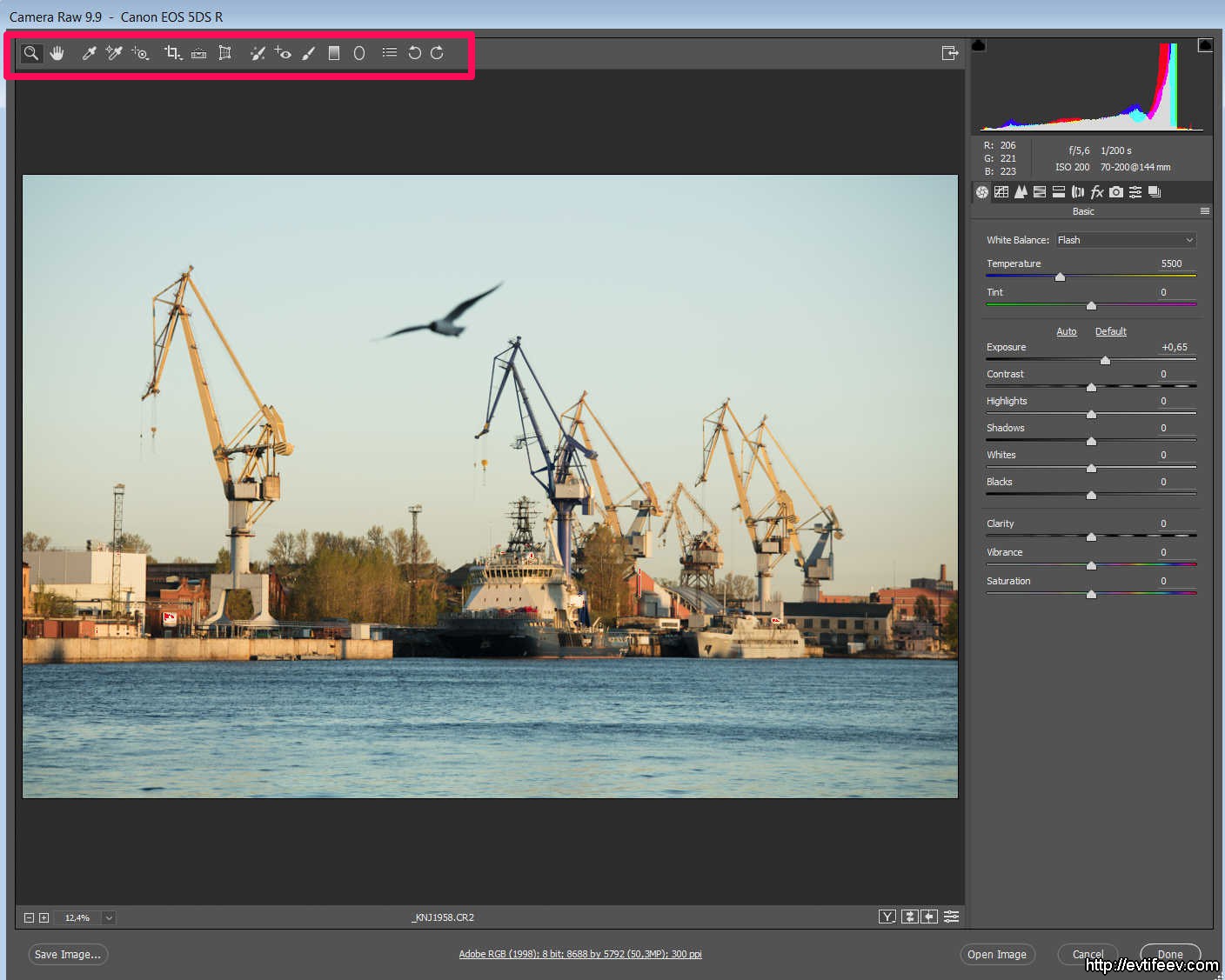
In this panel, the tools are essentially concentrated, although in the latest edition some more complex elements have migrated to it.
Magnifier

About Magnifier there is not much to say. Zooms in and out on a portion of the picture. You can do the same using the Ctrl + "+" / Ctrl + "-" keys (for Mac use Cmd instead of Ctrl).
Arm

Tool Arm allows you to drag a section of the image across the screen if the image is larger than the active window.
White Balance Tool
Color Sampler Tool

In the picture you can see three "scopes" in different places. And an informational place where the color values \u200b\u200bfor these three points in the image are shown.

Typically, you need to set several control points in the image to track changes in important places when you work with color, lightness or contrast of the image. This option is for relatively advanced photographers / retouchers and allows you to stop in time while improving the image in the "development" process.
Targeted Adjustment Tool

Tool Targeted Adjustment Tool allows you to influence the image using tabs Tone Curve and HSL / Grayscale... In my opinion, not a very useful tab, in the same way you can use these tools through the main menu.

In this tool, you can select the aspect ratio of the future fragment and "turn on" the grid.
Transform Tool
A very useful tool that I first discovered in the RAW converter Capture One... Allows you to correct the geometry of the image, where there are straight lines by placing these lines in the correct position.
![]()
In this picture there are straight lines on the left and right along which you can see the geometric distortions of the picture and, guided by them, you can correct the distortions. This happened because I tilted the wide-angle lens down a bit. The vertical lines began to diverge at the top. If I lifted the lens up, they, on the contrary, would converge. A conventional lens is often useful to raise and lower down. the field of view of the lens does not always capture what is needed. Only gimbal cameras can change the composition without tilting the lens. I have already written about lenses, and we will talk about gimbal cameras in the next articles (very soon).
I marked the guides with red rectangles, which I just placed along these straight lines, which should be vertical. The program itself understands where the lines should be vertical, and where the horizontal (evaluates the angle of inclination), so you just need to put the guide in the right place and the image will straighten itself.
![]()
Another example.

Old photographs, before 1925 approximately, please us with the correct geometry. Why is that? Yes, because up to this point, all photographers filmed with gimbal cameras, which made it possible to correct the geometry of the image. This is easy to see from architectural photographs, the walls of buildings along the edge of the frame are always parallel to the edge of the image.

Parade of the Life Guards Horse Regiment

photo: Karl Bulla, famous St. Petersburg photographer of the early 20th century.
Interior view of the Passage of St. Petersburg. 1900
It would seem, why did they come up with other cameras, if the gimbals were so perfect? For a simple reason - they are very heavy.

karl Bulla himself.
Filmed with such cameras almost exclusively from a tripod. They were transported only by cart, horse, and later by car.

Ansel Adams stands on the roof of the car with his gimbal camera. Another photography legend that I highly recommend reading if you haven't already.
In 1923, Mr. Oscar Barnack, after suffering with the then cameras in his mountain walks, invented the camera, which later became known as Leica I... From this moment you can start counting images with distorted geometry :)
But on the other hand, it became possible to climb with a camera even on Everest, which some took advantage of (some, however, remained there with the camera).
![]()
This picture was taken at ZEISS Distagon 15 / 2.8... A very wide-angle lens that tilts the walls towards the center when the lens is tilted down (to capture the track).
With a red square, I marked the additional menu for the tool Transform Tool... This menu has simple perspective controls, and if I were exactly in the center, I would ideally straighten the walls with one flick of the hand, the very top item of this menu (in the frame).
![]()
I was standing slightly to the right of the center of the corridor, so the right wall leaned more (when correcting the right wall, the left one leaned to the other side) and for this particular shot it is preferable to use the guides, as in the previous case. But if it was in the center, it would be corrected in one step.

result of geometry correction
Another example is a shot of a building from the front if I'm not standing in the center of the building. In fact, in the case of a wide-angle lens and the absence of special means for checking the position of the camera, it is difficult to stand exactly in the center, and sometimes it is impossible when there are some obstacles in the form of other houses, pillars, etc.
![]()
From the photo, I see that the left side of the buildings is larger than the right, which means I was standing to the left of the center of the subject (two buildings). To correct geometric distortion, I will use the second menu item.
![]()
The perspective was improved at the cost of a substantial piece of the frame. But nevertheless, for amateur filming, this is a good way to get an acceptable shot.
I will not comment on the rest of the tools in such detail. they are too simple:
Rotate - image rotation, allows to align the horizon line. We used to do the same thing more accurately with a "ruler".
Aspect - fixes aspect ratio (never used for real frames before).
Scale - the scale of the picture (never used for real frames).
Offset X, Offset Y - offset along the axes (never used for real frames).
Spot Removal
Stain removal tool. Convenient in that its effect will be preserved even if you open the RAW file later and change the exposure, contrast or any other element of the image development. You can also remove this stain fix, this action is not destructive.

On the right there are settings for Spot Removal, which include brush size, brush feathering, and brush opacity.
Understanding the correct settings will come quickly with experience.
Red eye removal
Tool Red eye removal, as the name implies, serves to remove the red spot in the eye, which is formed due to the illumination of the pupil of the person portrayed by the flash "in the forehead".

In the left menu, you can select the pupil size and shade.
The red pupil is selected with a stretched frame, the program itself finds the red spot and desaturates it. It works quite effectively. There is nothing to show me. "On the forehead" I do not use a "naked" flash and I do not advise you. Most often this happens when shooting with a smartphone or "soap box", where the flash is built-in.
Adjustment Brush
Adjustment Brush Is a very useful tool!
Allows you to make all adjustments locally, i.e. only in the places where they are needed. Adjustments can include anything: exposure, white level, black level, contrast, micro contrast, and a bunch of other settings.

Let's say you've photographed the liner. Lights are on on the liner and they, by themselves, are beaten out in white and yellow glare on the night landscape. This is not always a good thing. there is also a so-called "halo" around the large glare, i.e. glowing circle.
In this image, the white highlights are shown in red. We will "eliminate" them.

I took Adjustment Brush and drew everything that you see in purple (the mask showing your actions with a brush can be turned on and off with a tick at the bottom of the menu). I actually set the white to -6 and brushed the lights and highlights from them. On a real image, there will be less overexposures, if they are not completely knocked out, in Adobe camera raw there is a margin, a safe white shift in plus when developing, so that you can take advantage of the recovery of highlights.

Result
Let's try to increase the micro contrast locally.

original shot
Here we see a stone that is not too contrasting, but with the potential to increase contrast since it has colored facets, white and dark gray facets. We will remove overexposures with a brush and increase the micro contrast.

I sketched a stone to increase the micro-contrast.

Increased micro-contrast and removed overexposures.

The result is something like that. This is a very fast shot and very fast processing (only I took the shot in black, where the dust is less visible).
Graduated Filter
Suppose you are out for a photo walk without your favorite gradient filter, which allows you to even out the illumination of the earth and the sky. And here is such a landscape ...

It's okay, but the sky is too bright. And then the gradient filter comes to the rescue from Adobe camera raw... First you need to set the exposure to minus (how much you need - try it experimentally), and then stretch the gradient from top to bottom. To make it stretch straight down, hold down the SHIFT key.

Accordingly, the gradient can consist of completely different effects, any indicated in the right menu. For example, it can be colored.

regular gradient

Radial Filter
The last of the considered filters will be Radial Filter... It allows you to apply all the parameters of the image in the form of a circle or oval. It is sometimes convenient to highlight the center of the composition.

Sub-panel menu - "secret functions"
Let's say we decided to shoot something very long or tall. Creation of a panorama will help us with this. We take several shots by rotating the camera on a "panoramic" head, on a real panoramic head (where the lens is fixed at the nodal point), or using a tilt-shift lens. At the output, we have several frames with an offset.

We open these files in Adobe camera raw.

At the top left there is a small button, when you click on it we will see a small menu. It is already open in the screenshot.
The menu offers us three functions:
1. Synchronization of images by development parameters (it is very useful for a series of photos)
2. Creating an HDR picture (we will not dwell on this function, since Photoshop does not implement it well)
3. Creating a panorama (Photoshop does it well)
Panorama creation
Select three images using Ctrl + A or simply mark them with the Ctrl key and click the mouse.
We select the function of creating a panorama.

Panoramas are different and, accordingly, their projections too. Panoramas are a separate topic, we will talk about them in the article about panoramas, but now we just select the type of panorama "Perspective" because I shot on tilt-shift and all the lines are straight.
Adobe camera raw will think a little and make you one more picture under the already existing three in the list - this will be the stitched panorama.

Now you can work with it as with a regular picture, change: exposure, contrast, remove noise, etc. All actions will now be applied to a large panoramic image in DNG format (the program itself will offer you to save it as DNG in order to preserve all the features of the "raw" original).

Then Open File turn into Open object and you can open the photo in Photoshop as a smart object. This is convenient for subsequent work on pulling out shadows, adding pictures, etc. since by clicking on the thumbnail of the layer with the image, you will again get Adobe camera raw and you can change all the image development settings.

On the one hand, this is very cool, but on the other, it greatly increases the file size and slows down the work with the image.

As you can see, we got an 81 megapixel panorama, you can make a poster 120 x 50 cm with the quality of a glossy magazine.

Outcome
Skillful work with RAW converter often excludes work in Photoshop itself, so you save a lot of time when using the functions RAW converter to a greater extent. Plus work in RAW converter is not destructive in nature, i.e. something can always be canceled or corrected.
I hope my impulse of three parts to write this article will be useful for you, will make your work more effective. If you want to continue to see such articles, do not forget to click the repost on social networks (buttons on Vkontakte, Facebook and others just below in the form of small icons).
A lot has been said about RAW conversion, and at the same time little. The main drawback of the materials that I have come across is that they say little about RAW conversion itself. Basically, the articles boil down to describing the capabilities of converter programs and their comparison with each other. While most of the capabilities of most RAW converters are not directly related to conversion. At the same time, when it comes to finally the conversion parameters, their description is often reduced to general comments in the spirit of "darker / lighter", which do not give an understanding of the logic of using these tools. According to my observations, the majority of novice photographers, even after reading books and articles, continue to be tormented by the question "what happens if I move such and such a slider and, in general, in what sequence they should be moved." Let's try to fill this gap a little.
Main settings
First of all, let's figure out what will happen when setting the basic parameters for RAW conversion. At the same time, let's try to do without physics, mathematics and other fundamental processes that are behind this. We will consider the example of Adobe Camera RAW, although in general this information is applicable to all converters (although the name of the parameters from converter to converter may change).
I would like to clarify right away that the RAW conversion algorithms are closed. Therefore, there is no unambiguous information regarding some of the capabilities of RAW converters, whether they relate directly to conversion or are additional functions that can be used in an ordinary graphics editor. Therefore, within the framework of this article, the division of parameters into "converting" and "additional" is somewhat arbitrary.
Exposure
This parameter sets the brightness of the white point. At the same time, the brightness of the black point practically does not change, and everything between them is "stretched" or "compressed" in a new range of brightness. It is fundamentally important - when the parameter values \u200b\u200bare increased, its algorithm does not prevent the highlights from clipping (similar to the right slider of the Levels tool in Adobe Photoshop).


When magnified significantly, it leads to the appearance of noise in the shadows.
Blacks
This parameter is the opposite of Exposure and controls the brightness of the black point, fixing the white as much as possible. Not caring if shadow clipping occurs or not. Unlike Exposure, it can only change in one direction.

Recovery
The Recovery parameter is responsible for the redistribution of the brightness information in the lightest part of the image - reducing the brightness of light points in general and, if possible, restoring information in overexposed areas. The brightness of the points in the rest of the tonal range remains practically unchanged.

With a significant increase, it leads to a decrease in the overall contrast. That can be compensated by increasing it through other tools.
Fill light
Fill Light literally translates as "fill with light" (meaning filling shadows with light, by analogy with the terminology used when controlling light in studio shooting) and is the opposite parameter of Recovery. Deals with the redistribution of brightness in the darkest areas of the image. At the same time, the brightness of points in the rest of the tonal range remains practically unchanged. Unlike Recovery, it is not capable of recovering information in dropped (cut off) shadows.

Large Fill Light values \u200b\u200bcan result in noise in the shadows.
Note. The clipping of information in highlights / shadows is also affected by the set values \u200b\u200bof other parameters of the parameters - primarily Vibrance, Saturation, Temperature, Tint.
White balance
The Temperature parameter determines the overall color balance by changing the hue of the image along the "b" (Lab) axis. And the Tint parameter is along the "a" (Lab) axis. Since most photographers are used to dealing with RGB images, in other words, it can be described as follows: changing the Temperature and Tint parameters affect the relationship between the brightness of the RGB channels, which affects the overall color balance of the final photo.

Brightness
This parameter is responsible for the overall brightness of the image. Increasing / decreasing increases / decreases the brightness of all points in the resulting tonal range. Brightness increases / decreases out of proportion - most of all in midtones and least of all in light and dark tones. Even a significant change in brightness practically does not lead to clipping of highlights or shadows.


At high magnifications, it may cause noise in the shadow areas of the image.
Contrast
The Contrast parameter redistributes the brightness at the same time in penumbra and three-quarters of the highlights, without changing the brightness of the midtones. With positive values, penumbra becomes darker, three-quarters of the light is lighter. With negative penumbra lightens, three-quarters of the light darkens.


An excessive increase in contrast can lead to clipping of information in highlights and shadows.
Curves
Curves are available in most RAW converters. It is a powerful tool that allows you to determine how your future photo will look. Whether you want to use it in a RAW converter or not, depends on whether you want to get the final result after conversion, or a template for further work in a graphics editor.
Some of the brightness-contrast operations described above (but not all) can be done using the tone curve, and more flexibly controlling the redistribution of brightness. For example, the Contrast parameter is similar to this curve shape (left). And in the case of working directly with the curve, we can set it more precisely, taking into account the individual characteristics of each particular photo (example on the right).

Note for those using Adobe Lightroom. This program does not allow you to set points to work with the curve manually, this feature is available in Adobe Camera RAW.
Clarity / Vibrance / Saturation
In this group of parameters, Clarity is in fact a kind of more complex analogy for the HiRaloAm special effect (Hi Radius Low Amount in relation to the Unsharp Mask parameters). Vibrance and Saturaton are similar in effect to the corresponding tools in Adobe Photoshop. We discussed in detail the difference between these parameters in this note.

All other tools of the Adobe Camera RAW converter are even more "appendages" than those listed. Although, of course, they are intended to simplify the life of photographers. You just have to be aware of the fact that these are additional, in some places rather severely limited features that can also be implemented in Adobe Photoshop (and, as a rule, of better quality).
Sequence of setting parameters
Now let's try to build some algorithm for setting parameters in the RAW converter. Why some. The fact is that, generally speaking, it very much depends on whether you are striving to get the final result in the converter, or the best possible workpiece for subsequent processing in Photoshop. At the same time, it is possible to suggest some general logic.
It is important to understand that the perception of color depends on its brightness. In addition, the composite RGB curve and other brightness-contrast parameters affect the color characteristics of the image. Therefore, it would be logical to first set the cutoff points, brightness, contrast, and then color balance and other color settings (if required). This does not mean that you cannot return to certain steps and make corrections along the process, but nevertheless, I would suggest adhering to the following sequence of actions:
0. We start from the values \u200b\u200b"by zeros" - that is, we set all parameters to zero, the tone curve to the Linear value. This will allow us to see an image that roughly corresponds to the one in the RAW file. In this case, the picture will be faded and half gray - this is normal. White balance at this stage can be set either As Shot (often it turns out to be normal to start working), or approximately by eye (if you can immediately see that the color is too much shifted).
- Set the white and black point with Exposure and Blacks.
- If necessary, restore minor overexposures using Recovery and lighten the shadows with Fill light.
- If you need to get a finished and or more or less finished photo after a RAW converter, set the contrast and brightness. I recommend doing this through the Curves tool whenever possible, as it is more flexible than parameters. Brightness and Contrast, although they can be used in combination.
- Setting the overall white color balance using parameters Temperarure and Tint.
- If necessary, reduce or increase the saturation of the photo through Vibrance and Saturation.
- If necessary, you can use other additional tools - adjust subtle color nuances through the HSL / Grayscale color equalizer, fight chromatic aberrations and vignetting in the Lens Correction tab, crop, level the horizon, experiment with camera profiles in the Camera Calibration tab, etc.
These are the considerations. I hope they are helpful. If I made any inaccuracy, I will be grateful for the amendments. Anyone who wants to better understand the issues of RAW conversion, I recommend visiting the seminar of Alexander Onishchenko RAW conversion or the course of Anton Martynov Working in RAW converters, where the raised and other issues are revealed deeper.
Series: Secrets of Camera RAW
We continue to study the chapter from the book “ Secrets of RAW. Full color edition. 2nd ed."Alexandra Efremova, today we will consider adjusting images in Camera Raw.


Some professionals who are used to working with curves in Photoshop may decide that this is the tab for adjusting the image in Camera Raw. This is the wrong approach. The Curve tab works in conjunction with the Basic tab. First, make all the necessary settings on the Basic tab, and then, for more accurate correction, go to the Curve tab.
The curve on the sub-tab Parametric is used to adjust values \u200b\u200bin specific ranges of tones in the image: Highlights, Lights, Darks, or Shadows. The middle region properties (Dark and Light) mainly affect the middle region of the curve. The Highlight and Shadow properties mainly affect the extreme values \u200b\u200bof the tonal range.
To adjust the curve, move the Highlight, Lights, Darks or Shadows sliders on the Parametric tab. Thus, the areas of the curve affected by the sliders expand or contract. Another way to correct can be to move any point on the curve in the nested Point tab. As you drag this point under the tonal curve, the Input and Output values \u200b\u200bchange.
Working with the parameters of this tab, you should view the image at a scale of 100% and larger, since in a small image such details of the image as sharpness or noise are simply not visible.
Sharpening(Sharpening). Some of the sharpening settings are similar to those of the Usharp Mask filter in Photoshop.
Amount(Power). A zero value does not sharpen. When you open an image, Camera Raw calculates the value to use based on the camera model, ISO value, and exposure compensation.
Radus(Radius) sets the radius of the outline in pixels. Choose the lowest setting for photos with fine detail. For photos with low detail, the radius can be increased. If the radius is too large, the image quality will decrease. By default, the Preview Only option enabled allows further image processing in Photoshop. If you do not plan to process the image in Photoshop, you should activate the Sharpening option in the Preferences dialog box (these settings are discussed later in this chapter).
Detail(Detail). At low values, sharpens contrasting edges without affecting flat areas of the photo, such as the sky. Higher values \u200b\u200bincrease the definition of image textures.
Masking(Masking). This parameter creates a mask and specifies where to sharpen. If the value is zero, the sharpness is the same throughout the image. At a value of 100, sharpness is mostly enhanced near pronounced edges. By pressing Option (Alt) while dragging this slider, you can see where the sharpening will be - the white areas, and where not - the black areas. The gray areas will have an intermediate value. Attention! The option works when displaying 100% or more.
Noise Reduction
Luminance(Brightness). Brightness noise increases with slow shutter speeds and even more with increasing sensitivity. In these cases, the image looks grainy, especially in the shadows.
Color(Colour). Visually, color noise is similar to colored snow and tends to show up in shadows, especially in the blue channel. In some camera models, color noise increases with increasing light sensitivity. Adjusting the Noise Reduction parameters is always a trade-off between maintaining image detail and reducing noise.


The options on this tab allow you to adjust individual color ranges. For example, if the subject looks too bright and distracting from other elements of the photo, then you can lower the saturation in the Saturation tab.
Hue(Chromaticity). Shifts the color to one side or the other of the color wheel (Fig. 3.34).
Saturation(Saturation). As the name implies, changes the color saturation. For example, you can change the color of the sky from a dull gray to a deep blue or cyan.
Luminance(Brightness). Changes the luminance component of the hue. When the Covert to Grayscale check box is selected, one sub-tab, Grayscale Mix, is displayed.
Details on converting photographs to grayscale, more precisely, to black and white, will be discussed in the chapter "RAW and black and white photography".
The settings on this tab allow you to color a black and white photo in one or more tones. (For details on toning images, see the chapter “RAW and black and white photography”.)
By applying these settings to a color image, you can, for example, simulate a cross-process.

Lens Corrections Tab
The settings of this tab (Fig. 3.23) allow you to remove or minimize chromatic aberration, which, first of all, appears on low-quality and / or wide-angle lenses. Chromatic aberration is more noticeable on matrices with small pixels.
Fix Red / Cyan Fringe Options (Remove red / blue border) and Fix Blue / Yellow Fringe (Remove blue / yellow border) to minimize chromatic aberration.
Defringe(Remove the border). Select All Edges to remove chromatic aberration for all edges, including abrupt color changes. If, when using the All Edges item, thin gray lines or other undesirable effects appear near the edges, you should select Hightlight Edges (Edges of highlights), to correct the colored border only for the edges of the highlights. Select Off to disable border removal. The Fix Red / Cyan Fringe and Fix Blue / Yellow can be changed, but chromatic aberration can be removed only for one corner of the image.
The parts of the tab related to Vignetting make it possible to reduce (rarely increase) the darkening of the corners of the frame, which, first of all, occurs when shooting with wide-angle lenses.
Amount(Effect) - the degree to which the corners of the frame are lightened or darkened.
Midpoint(Midpoint) defines the scope of the Amount parameter.

Presets Tab (Fig. 3.24)
Settings for any parameters can be saved as specific presets, and then applied to specific images either through Bridge or through Camera Raw. When you save the settings (the first button in the lower corner of the tab), a window will appear in which you should set a friendly name and specify the parameters used (Fig. 3.26).
Snapshots Tab
While working on a specific image, you can save settings for the current session (Fig. 3.25). You should only remember that states, unlike presets, are saved only for a specific photo and during the current session.

Camera Calibrate Tab (Fig. 3.27)
The controls on this tab are designed to fine tune the profile of a specific camera model. At the same time, you can calibrate the colors for different lighting conditions: for daylight, flashlights (flashes), incandescent lamps, etc. On the Adobe website (Adobe Labs page) you can download profiles corresponding to different cameras and standard scenes, for example, a portrait or scenery. And Adobe Standard profiles significantly improve color reproduction, especially in reds, yellows and oranges. When you install an update to Camera Raw (5.3 at the time of this writing) or Lightroom, such as version 2.2, the profiles are installed automatically. The conversion profile for a specific image or group of images should be selected from the pop-up list (see Fig. 3.27). For this profile to be applied to all photos, after selecting it, you must save the settings. To do this, select the Save New Camera Raw Defaults menu item. This operation must be performed for each digital camera model.
If these profiles are not enough or there is a need to build profiles for specific standard lighting conditions, you can use the free DNG Profile Editor (Fig. 3.28). To edit any profile in the program, open an image saved in DNG format and edit it. To create a profile, you need to take a picture of the Color Checker scale and build a profile on it (Fig. 3.29). The latest beta version of DNG Profile Editor was released on October 22, 2008.
To download profiles, you need Camera Raw 4.5 or Lightroom 2.0 or later. The profiles can be used in any Raw converters that support the DNG 1.2 standard.
Please note that different profiles only work with RAW files. Profiles do not support images converted to, for example, TIFF or JPEG.
You can also use the Camera Calibrate tab to creatively convert your RAW file.
How to find a remote job?
The rapid growth in the demand for remote work on the Internet has led to the emergence of many specialized resources that act as an intermediary between customers and performers. Working from home does not always allow you to effectively search for regular customers, and the latter regularly need new performers for permanent or one-time tasks.
I would be grateful for the pluses, likes and retweets! Thanks in advance!